Educational Attainment in England - A Deeper Dive
Last Updated:Table of Contents
Introduction #
On the 25th July 2023, the UK Office for National Statistics produced a wonderful piece of data journalism with open access to their dataset measuring educational attainment across England. The article’s title “Why do children and young people in smaller towns do better academically than those in larger towns?” hides a bold claim in the form of a question. I like to assume that their research question(s) did not start from such a knowledge claim but rather the title emerged from the themes they discovered during their investigation.
In fact, the article’s subtitle provides more of a clue over the sort of questions they must have been asking, uncovering correlations to attainment with factors in the social environment:
Overall, I found the article fascinating and enjoyed the approach they took, with plots and visuals that offer immediacy of comprehension to a non-technical audience, and explanations that are free of statistical jargon.
Grateful that the authors have published the data set along with embeddable chart objects, I thought it would be interesting to consider some deeper analyses with a more technical audience in mind. So, I’ve re-run some of the key findings, adding a handful of more advanced statistical tools. These tools allow me to make more detailed inferences, and possibly deeper insights.
Obviously, the ONS do not need me to tell them how to analyse data! I’m sure that the ideas presented here were considered, discussed, and then pared back to the most digestible form. Part of the ONS remit is to choose a level of detail to communicate to the broadest possible audience. My intention with this write up is simply to work in a way that is not constrained by the same concerns.
Note, as usual, I defer printing the source code until the end of the document, except where I have modified the data. In that case, the code is shown so the reader can understand the actions in context
Note also, where I have embedded plots from the ONS article, you will see the appropriate credits. Everything else here is my own.
Research Questions #
The ONS investigation uncovers some important interactions between town size and level of income deprivation, but the complex nature of this effect is set aside in favour of a series of easier to understand bivariate analyses. I would like to consider the following:
- Is town size a factor in educational attainment when controlling for other variables, such as level of income deprivation?
- Are regional effects a significant factor in educational attainment, or are there more powerful local factors at play?
Analytic Strategy #
I will proceed in two phases:
- An initial exploratory analysis with descriptive statistics, undertaking an enhanced approach based on the original article:
-
A critical assessment of the descriptive plots and charts inn the original report, adding a further level of detail, where possible.
-
An audit of the differences between groups that were shown in the original article, engineering new features from the provided statistics that offer a greater level of statistical scrutiny (modeling variance, uncertainty, etc).
- A modelling approach that handles hierarchical groupings such as town and region, enabling us quantify the differences in attainment at different geographic levels.
Initial Exploratory Analysis #
I have downloaded the original full data set. The data refer to a cohort who sat GCSEs in 2012-2013 and is a longitudinal study of their performance from Key Stage 2 (2007-8), and comprising GCSE results, and qualifications and/or other indicators at ages 18 and 22. That is to say, all the counts, percentages and scores listed relate to this one cohort, unless otherwise stated. Where something is listed with the word “score” in the field name, this is a derived score for which the formula may or may not be available. However, it is applied across the cohort and can be used for between group comparisons.
The data are imported from a csv file. There are 1104 rows and 33 columns. All the necessary detail is in the original article. So, for brevity, I will skip over a comprehensive EDA and descriptive statistics. Instead, I will look at some of the original visual analyses and the claims made about them, and then carry out an enhanced analysis.
“Young People Do Better Where The Older Generations Have Higher Attainment” #
The article presents findings of an inter-generational relationship, which stands up to instinct and reasoning. It is fair to assume that educated parents, other family members and friends are better equipped, through their own experience, to support their children’s education more deliberately and methodically.
The main dataset, in fact, contains a categorical variable for older HE attainment, and here I present one of the first exploratory plots I created from it, as an alternative view of the same information. This is a one-sided bee swarm plot of the cohort attainment score, coloured by the older HE attainment category.
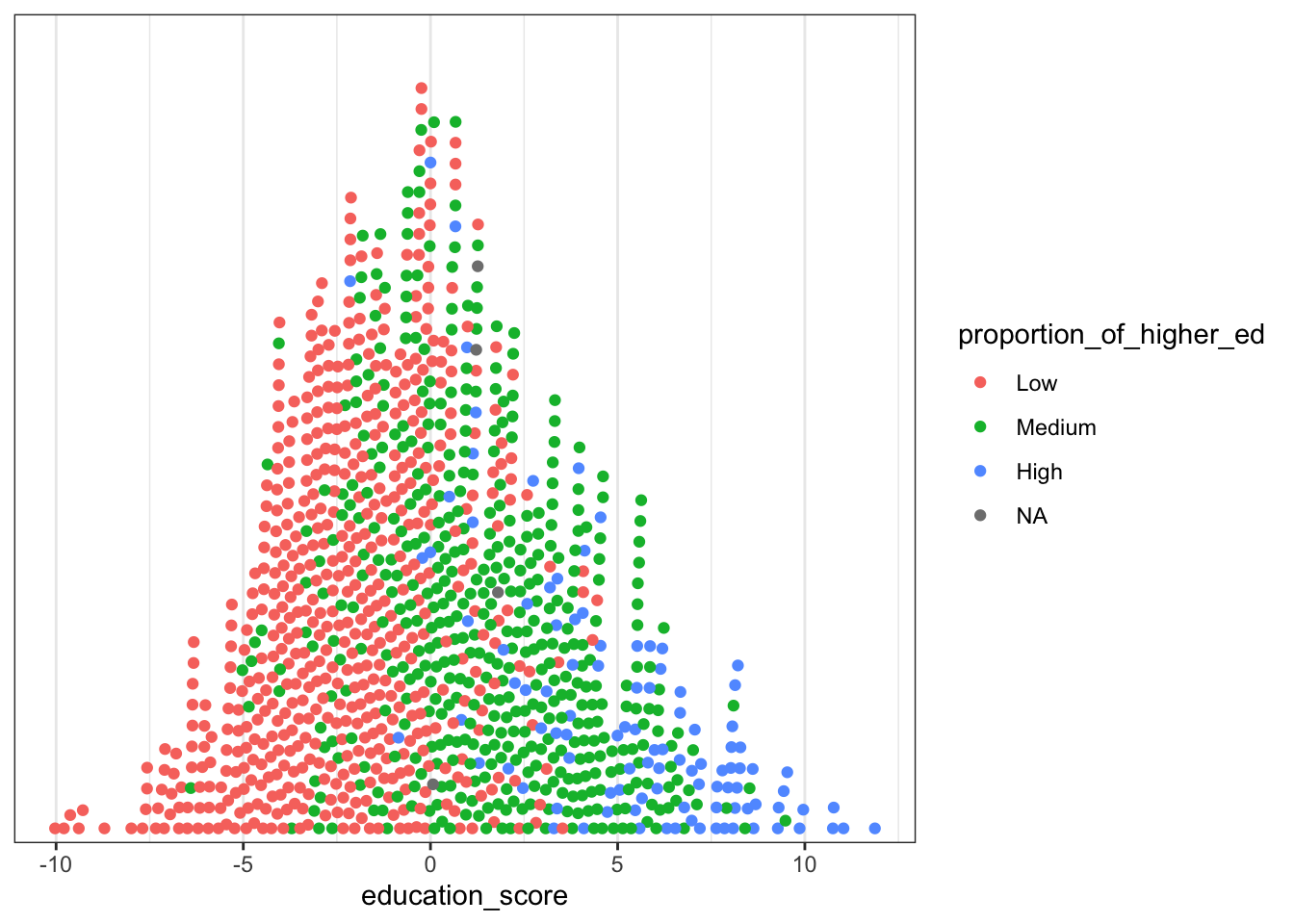
I like this plotting approach when there are enough data points over the range of given values because the shape gives a sense of the data density. A kernel density estimation (KDE) plot is a standard tool to use in the visualisation of univariate data but there are subtleties that are good to view with this alternative perspective. Consider the following two plots for comparison:
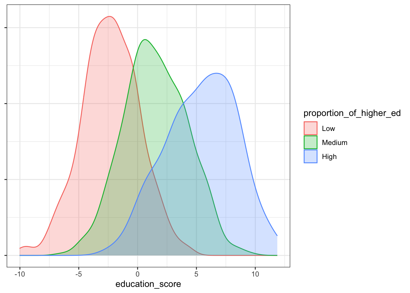
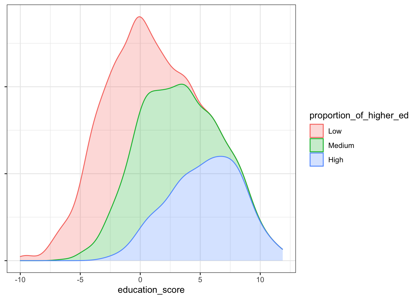
You can see with the KDE plots we still visualise the distribution among the factor levels, but the emphasis is on their separateness. The bee swarm plot, on the other hand, gives and impression of the distribution while allowing the data points to mix. It’s more intuitive than scientific but given the subject matter is families and communities, it seems to offer a better metaphor for the towns and villages from where the data are drawn.
Reproducing the original scatterplots #
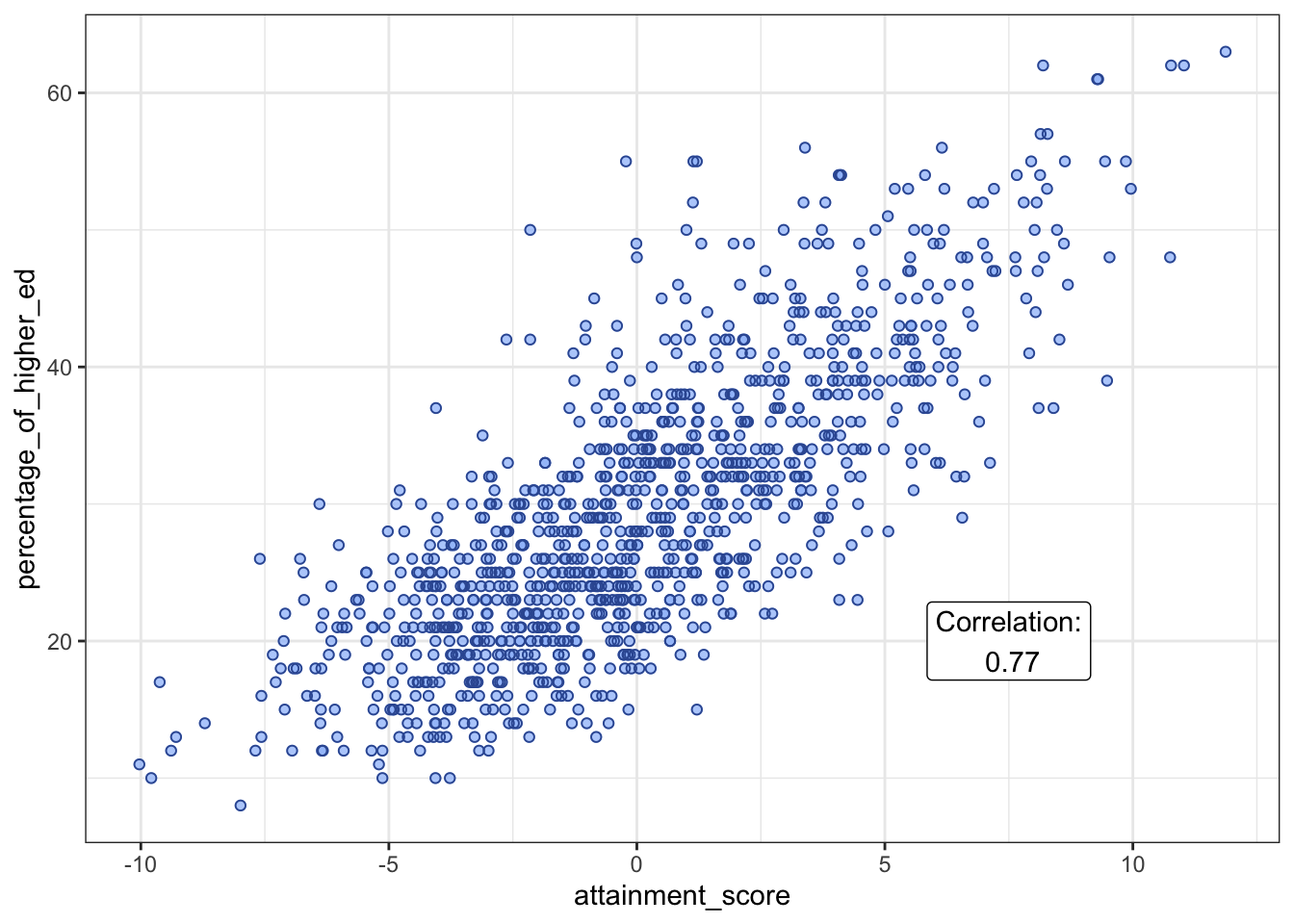
The raw percentage of older graduates in the population was available as a separate file download in the article. The original authors presented a scatter plot of this relationship, showing a strong correlation. I have recreated this plot, annotating with the Pearson correlation.
“Pupils in Small Towns Do Better on Average” #
Now we move on to the claim that I am most sceptical about. The claim is supported by a beautiful beeswarm plot in the original article.
While it seems to be true that the groups preset with noticeable mean differences, these differences do seem to be very small. Furthermore, the variance for small towns is certainly the largest by quite some margin, and we see that there are many small towns scoring worst in the country. So, the sub-heading claim doesn’t appear to tell the whole story. To their credit, the authors do expand on this point for themselves and the claim itself appears to be sound under further scrutiny. For example, I can verify it through an ANOVA test of the three designations (Small/Medium/Large Towns), and a Student’s t test between just the Small and Medium Towns. Here are the results:
|
|
|
|
For both tests, the p-value is well below the 0.05 significance level, supporting the main statistical claim about differences between groups. However, I am left with niggling concerns:
- The variance for small towns is really large, with the extremes eclipsing the other groups.
- I am also bothered about the fact that there be an inflationary effect of repeating samples from the same broader geographical area.
While the original report does dig into large geographical regions, such as the North West, or the South East, these are enormous designations that do not capture granular socio-economic realities neighbourinng of small towns.
I have a hypothesis that nearby and neighbouring small towns are very unlikely to be genuinely independent observations when it comes to issues such as income deprivation. What if all the towns in a close geographical area suffered similar issues after the loss of a major local employer, such as a factory, mine or call centre? If a cluster of nearby towns provide similar measures because they are related by geography, proximity and recent economic realities, then their shared misfortune provides a cluster of non-independent samples. As statisticians, we must be vigilant towards sampling issues like this. Such sampling issues are the greatest source of bias and error in statistical investigations.
I will return to this topic later on.
“Towns With High Educational Attainment Have Low Income Deprivation” #
This is the most expected and predictable claim and any rational thinking person would intuit a causal relationship: income deprivation contributes to low educational attainment. I note that the original article is worded in the inverse order than my former statement, and teh wording also lands on the least stigmatising category labels (high educational attainment, low income deprivation). I think this is probably a deliberate editorial decision, made to ensure that no one accuses the ONS of implying such a causal relationship when they can only provide statistical evidence for correlation. I make no such claim either but I’m happy to point out that a causal relationship is very likely what people would assume.
The relationship can be seen in another scatter plot of attainment score vs income score. There was an accompanying additional csv file (for whatever reason, the income score was not part of the main file). Here I annotate the plot again with the Pearson correlation.
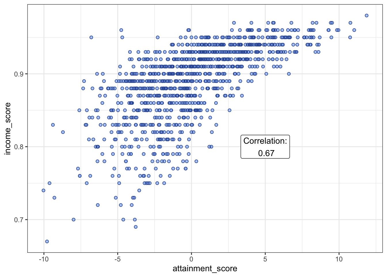
We see here a heteroskedastic pattern (reversed), with variance growing as the attainment score falls. This pattern adds to my suspicion other factor(s) are at play, mediating the relationship to attainment in lower income areas.
“Small Towns Are Less Frequently Classified as Income Deprived” #
Given the findings so far, this claim about the nature of small towns seems extremely important. It notes the under-representation of income deprivation as town size decreases. This is an interaction effect that really needs a closer look to understand the drivers for difference in attainment. Think about it; if the sample of small towns contains many more higher income towns, this underlying disproportion will bias the mean attainment score upwards, given the previous correlation claim.
The proportion of each town size designation under each income deprivation class (Higher/Mid/Lower Income Deprivation) is shown in the article with a fixed width horizontal bar plot.
Such plots are useful for their immediacy but some information in lost. I find various kinds of strucplots much more illuminating, especially when there are two- or more-way interactions. I present two mosaic plots for illustration. The Expected frequencies plot shows the expected counts under the Null hypothesis that income deprivation and town size are independent. The second Actual frequencies presents the observed counts.
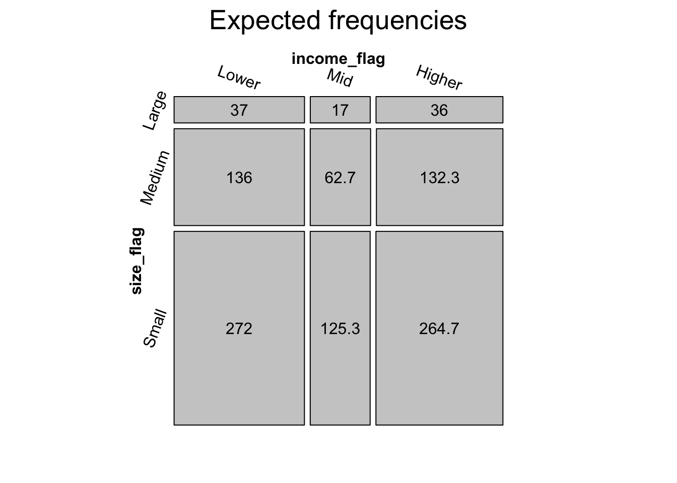
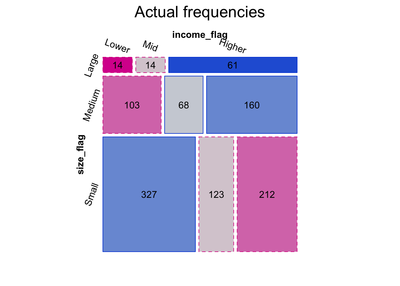
A mosaic plot is ideal when dealing with categorical and count data. It uses tile area to represent the count of each category intersection, resulting in tiles of varying width and height. The shading of the Actual frequencies mosaic follows a scheme according to the magnitude of the Pearson residuals (of a test of actual vs. expected under independence) at each intersecting level of the categories. The darkest blue indicates a significant over count and the darkest red is conversely a significant under count, when compared to the Null hypothesis. By linking shading depth to the Pearson residuals, the mosaic plot is more than just a visual check. It is a rigorous statistical test.
The mosaic plot provides evidence of the interaction that gave rise to my concerns and why I think it is essential to control for town size and income deprivation when investigating educational attainment.
“The Relationship Between Attainment and Income Differs Between Regions” #
In the original article, there is no mention of the potential effect of geographical proximity between towns and their recorded observations. I can understand that a choice was made not to dive into the increasing complexity of hierarchical modeling for the sake of holding the audience’s attention on the main findings. The authors present a very nice dot plot, illustrating the North West region’s best scores at all three income levels.
As mentioned before, I believe that geographical clusters of smaller towns may have economic effects in common that could bias the statistical inferences drawn from this data set. It would be prudent to find a way to adjust for the amplified signal arising from shared socio-political histories that are linked by physical proximity and connections between communities. Furthermore, the nearest large urban centre could also be an influence because of the presence of centralised education authorities and local funding decisions. To analyse attainment, taking into account the geographical hierarchy of nearest large urban centre and region, I will use a Linear Mixed Model (LMM).
When determining the modeling approach with LMM, it is important to make reasoned decisions about a plausible structure for the hierarchical relationship. LMM allow for different intercepts, or different intercepts and slopes for each independent variable. The proximity relationship is essentially a binary choice: Aylesbury either has London as its closest city, or it does not. Hull is in the region Yorkshire and the Humber, or it is not. Both of these examples are true, by the way. So, it only makes sense to model different intercepts here for both hierarchical factor levels. Slopes would be applied to numerical independent variables. The “/” notation indicates a hierarchical grouping here of ttwa11nm (urban centre) within rgn11nm (region).
|
|
|
|
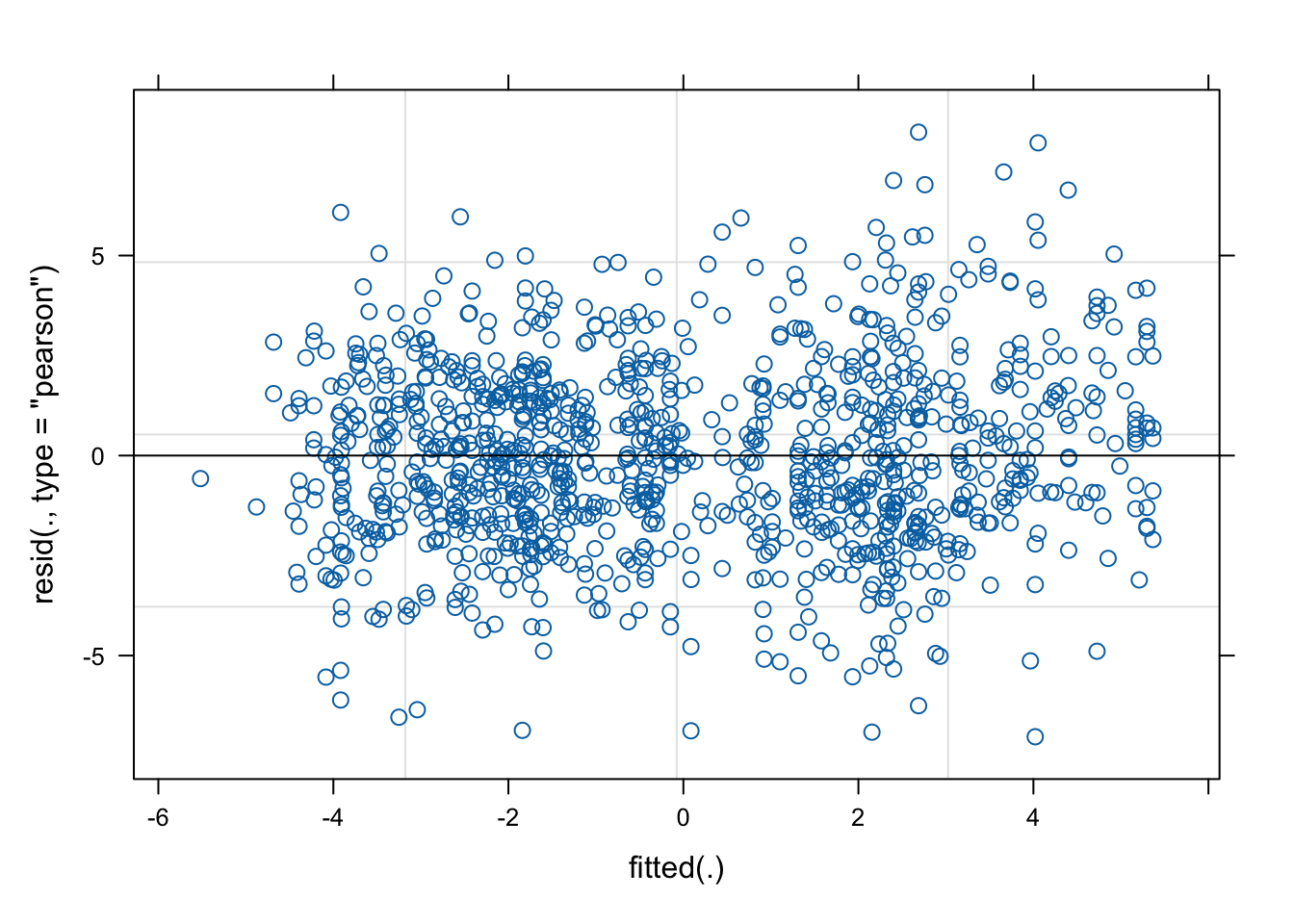
There is a bit more to interpret than we would get from a multivariate linear model. Importantly, the model converges easily and the scaled residuals are fairly symmetrical about zero. The fixed effects only show correlations between different levels of the same factor. These are all good diagnostic indicators, as is the residual plot here:
The main statistics are really interesting. The intercept can be taken as the base value of attainment score and is set to reference levels “Large Towns” and “Higher deprivation towns”. The fixed effects of income deprivation agree with the official investigation. As the levels of income deprivation ease, the attainment outcomes rise dramatically. As I said before, this is the most obvious conclusion of the whole report.
However, in a classic case of Simpson’s paradox, the reported correlations between town size and attainment are reversed once we control for income and the geographical proximity in this hierarchical model. This is evident from the negative values associated with medium and small towns. The model shows that wealthy small towns do well while poor small towns do worst. The disparity in effect sizes explains the heteroskedastic scatter plot we saw earlier.
| coefficients | |
|---|---|
| Large Towns / Higher deprivation towns | -2.4851 |
| Medium Towns | -0.2876 |
| Small Towns | -0.4828 |
| Mid deprivation towns | 2.2839 |
| Lower deprivation towns | 5.8011 |
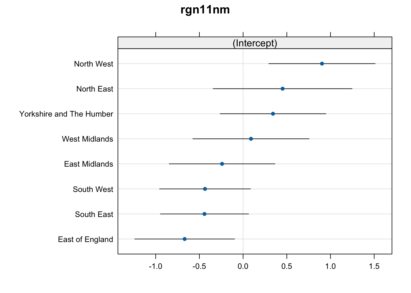
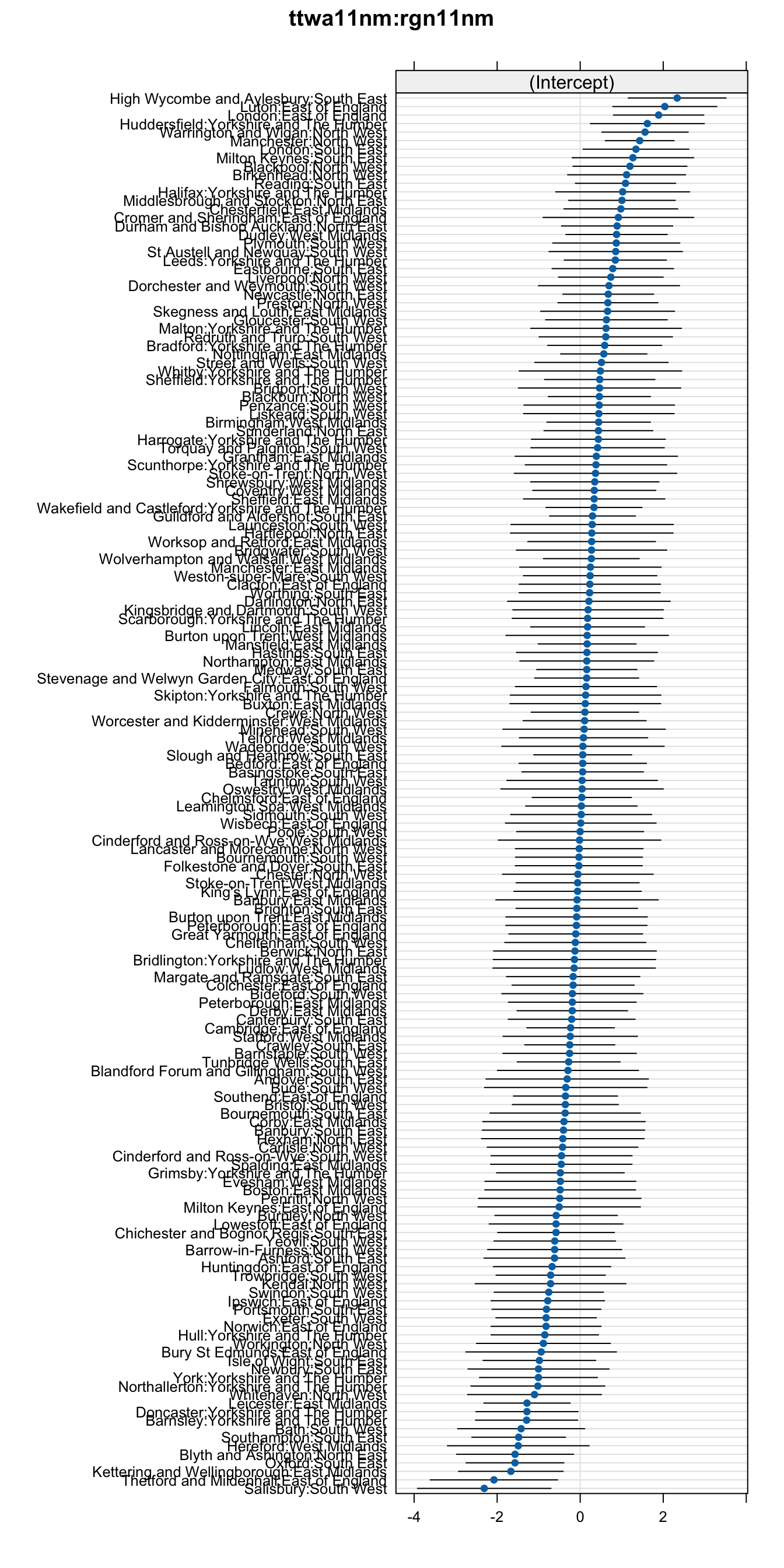
Looking at the variation in the random effects, we can see that the regional differences are also present, as reported in the article but rather more of the variation is explained by the nearest urban centres (the standard deviation is approximately double). So, things are much as I initially suspected. This result seems to validates my intiution; clusters of towns in the same geographical area are subject to local effects that also contribute to their educational outcomes. This effect is stronger than the wider regional effect. This concept is not reported anywhere in the original report.
| Group | Std.Dev. |
|---|---|
| ttwa11nm:rgn11nm | 1.0944333 |
| rgn11nm | 0.6247878 |
| Residual | 2.4152362 |
|
|
|
|
Summary and Conclusions #
I used a publically available data set that was provided with an already comprehensive piece of data journalism and analysis, to see if I could uncover any deeper insights than those presented to the original article’s non-technical audience.
- I confirmed the validity of some of the claims using standard statistical tests that were not discussed in the original write-up.
- I showed some alternative visualisations for the data that provide more nuance and information than the simpler graphics that had been chosen for a less technical audience.
- I used a hierarchical linear mixed model to control for multiple interacting factors and demonstrated that:
- proximal geographical effects are stronger than broad regional effects
- the original article may have made an erroneous claim about effect of town size on educational attainment because the effect was reversed when controlling for income deprivation
This detailed analysis shows that having multiple tools for different depths of analysis allows you to use multiple perspectives when looking for patterns and draw inferences from your data. Some tools suit a less technical audience and offer immediacy of understanding, while other more detailed tools are required for high impact decision support and policy making.
Appendix #
Here you can find the source code.
|
|