Hâtvalues

Statistical Learning for Heart Disease Diagnosis

Last Updated:
Table of Contents

Author’s Note (October 2020): In preparation for work on my published research paper Ada-WHIPS: explaining AdaBoost classification with applications in the health sciences, I wanted to develop some familiarity with medical statistics and diagnostic tools. I decided to take a fairly well-known medical data set and try something different. Instead of performing a straightforward classification model training as would be typical, I took a deep exploratory dive. My intention was to see if I could tease out some intuition as to what were the predictive patterns in the data. The exercise evolved into a potential approach to developing a statistical diagnostic tool, for similarly distributed data. My original report is reproduced below.

Advanced Exploratory Analysis of the UCI Heart Data #

Introduction #

We will conduct an analysis of the UCI Machine Learning Repository heart data set. This data set is often used for demonstrating classification methods. The target variable is usually AtheroscleroticHDisease, which indicates the presence or absence of pathologies of the blood vessels that supply the heart muscle itself. We will do something slightly different here and demonstrate several unsupervised machine learning methods to perform a thorough exploratory analysis. Exploratory analysis is essential for any serious data analytic work in order to develop an intuition about the data, identify the most important independent variables and determine the most appropriate confirmatory and hypothesis tests.

Note, we defer printing the source code until the end of the document, except where we have modified the data. In that case, the code is shown so the reader can understand the actions in context

Research Questions #

  1. Using descriptive statistics, can we identify patterns among the independent variables?
  2. Can we use unsupervised learning techniques to deepen our understanding of patterns and relationships in the data?

Analytic Strategy #

We will proceed in two phases:

  1. An initial exploratory analysis with descriptive statistics:
    1. to assess the data quality and perform any necessary cleansing.
    2. to develop an intiution of the distributions and interactions between variables
    3. this phase will comprise of visual analytics with density plots, box plots, fourfold plots and mosaic plots.
  2. A comparison of various unsupervised learning methods:
    1. matrix decomposition methods: PCA and Correspondence Analysis.
    2. clustering methods, including hierarchical and distance based methods.
    3. demonstrate any link between clustering and dimension reduction
    4. finally, compare cluster membership with the known target variable; is there alignment and could cluster membership be an indicator of the presence of heart disease in an individual in the data set?

Note, this is a little different then a typical classification model training. Rather than performing a train/test split, we simply exclude the target variable until after conducting the unsupervised learning techniques.

Initial Exploratory Analysis #

The data dictionary provides the following information:

name type notes
AtheroscleroticHDisease factor Presence of heart disease
Age integer Age in years
Sex factor The two accepted levels at the time of data collection
ChestPain factor Presence/type of chest pain
RestBP integer Resting blood pressure mm Hg
Chol integer Serum cholesterol mg/dl
Fbs factor Fasting blood sugar
RestECG factor Resting electrocardiograph results
MaxHR integer Maximum heart rate during exercise
ExAng factor Exercise induced angina
Oldpeak factor ST depression exercise relative to rest
Slope factor Slope of peak ST exercise segment
Ca small integer Number of major vessels under fluoroscopy
Thal factor No description given

The data is imported from a csv file. There are 303 rows and 15 columns. Below is the head and summary.

 1
 2
 3
 4
 5
 6
 7
 8
 9
10
11
12
13
14
15
16
## # A tibble: 303 × 15
##        X   Age   Sex ChestPain    RestBP  Chol   Fbs RestECG MaxHR ExAng Oldpeak
##    <int> <int> <int> <chr>         <int> <int> <int>   <int> <int> <int>   <dbl>
##  1     1    63     1 typical         145   233     1       2   150     0     2.3
##  2     2    67     1 asymptomatic    160   286     0       2   108     1     1.5
##  3     3    67     1 asymptomatic    120   229     0       2   129     1     2.6
##  4     4    37     1 nonanginal      130   250     0       0   187     0     3.5
##  5     5    41     0 nontypical      130   204     0       2   172     0     1.4
##  6     6    56     1 nontypical      120   236     0       0   178     0     0.8
##  7     7    62     0 asymptomatic    140   268     0       2   160     0     3.6
##  8     8    57     0 asymptomatic    120   354     0       0   163     1     0.6
##  9     9    63     1 asymptomatic    130   254     0       2   147     0     1.4
## 10    10    53     1 asymptomatic    140   203     1       2   155     1     3.1
## # ℹ 293 more rows
## # ℹ 4 more variables: Slope <int>, Ca <int>, Thal <chr>,
## #   AtheroscleroticHDisease <chr>
 1
 2
 3
 4
 5
 6
 7
 8
 9
10
11
12
13
14
15
16
17
18
19
20
21
22
23
24
25
26
27
28
29
30
31
32
##        X              Age             Sex          ChestPain        
##  Min.   :  1.0   Min.   :29.00   Min.   :0.0000   Length:303        
##  1st Qu.: 76.5   1st Qu.:48.00   1st Qu.:0.0000   Class :character  
##  Median :152.0   Median :56.00   Median :1.0000   Mode  :character  
##  Mean   :152.0   Mean   :54.44   Mean   :0.6799                     
##  3rd Qu.:227.5   3rd Qu.:61.00   3rd Qu.:1.0000                     
##  Max.   :303.0   Max.   :77.00   Max.   :1.0000                     
##                                                                     
##      RestBP           Chol            Fbs            RestECG      
##  Min.   : 94.0   Min.   :126.0   Min.   :0.0000   Min.   :0.0000  
##  1st Qu.:120.0   1st Qu.:211.0   1st Qu.:0.0000   1st Qu.:0.0000  
##  Median :130.0   Median :241.0   Median :0.0000   Median :1.0000  
##  Mean   :131.7   Mean   :246.7   Mean   :0.1485   Mean   :0.9901  
##  3rd Qu.:140.0   3rd Qu.:275.0   3rd Qu.:0.0000   3rd Qu.:2.0000  
##  Max.   :200.0   Max.   :564.0   Max.   :1.0000   Max.   :2.0000  
##                                                                   
##      MaxHR           ExAng           Oldpeak         Slope      
##  Min.   : 71.0   Min.   :0.0000   Min.   :0.00   Min.   :1.000  
##  1st Qu.:133.5   1st Qu.:0.0000   1st Qu.:0.00   1st Qu.:1.000  
##  Median :153.0   Median :0.0000   Median :0.80   Median :2.000  
##  Mean   :149.6   Mean   :0.3267   Mean   :1.04   Mean   :1.601  
##  3rd Qu.:166.0   3rd Qu.:1.0000   3rd Qu.:1.60   3rd Qu.:2.000  
##  Max.   :202.0   Max.   :1.0000   Max.   :6.20   Max.   :3.000  
##                                                                 
##        Ca             Thal           AtheroscleroticHDisease
##  Min.   :0.0000   Length:303         Length:303             
##  1st Qu.:0.0000   Class :character   Class :character       
##  Median :0.0000   Mode  :character   Mode  :character       
##  Mean   :0.6722                                             
##  3rd Qu.:1.0000                                             
##  Max.   :3.0000                                             
##  NA's   :4

Data Cleansing - First Pass #

There are several obvious problems with the raw data set. X is an index number column and should be removed. AtheroscleroticHDisease is too much to type, so we will change the name. Several variables are coded as numeric but are factors; Sex, for example. The documentation here is informative and guides the following corrections.

 1
 2
 3
 4
 5
 6
 7
 8
 9
10
11
12
13
14
15
# recoding
heart <- heart %>% select(-X) %>%
  rename(HDisease = AtheroscleroticHDisease) %>%
  mutate(Sex = factor(ifelse(Sex == 1, "M", "F"))
         , Fbs = factor(ifelse(Fbs == 1, ">120", "<=120"))
         , RestECG = factor(ifelse(RestECG == 0, "normal"
                                   , "abnormal")) # there are only 4 valued at 1, we'll reduce to just two levels
         , ExAng = factor(ifelse(ExAng == 1, "Yes", "No"))
         , Slope = factor(ifelse(Slope == 1, "down", "level")) # there few valued at 3, we'll reduce to just two levels
         , Ca = factor(Ca, ordered = TRUE))

# identify numerical and categorical variables for later use
classes <- sapply(heart, function(x) class(x)[1])
num_vars <- names(classes)[classes %in% c("integer", "numeric")]
cat_vars <- names(classes)[!(classes %in% c("integer", "numeric"))]

Identify Missing Values #

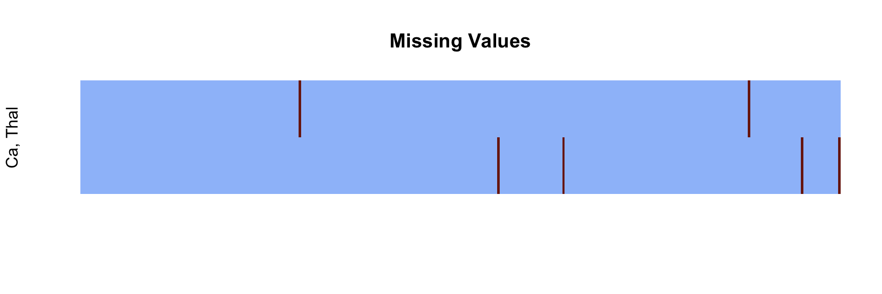
There is a very small number of missing values, which we would like to impute based on row-wise information. The figure demonstrates that there are no instances that share missingness in both the variables involved. The non-parametric nearest neighbours imputation is a reasonable choice, as it makes no assumptions about the data. This will be executed shortly.
Univariate Distributions #

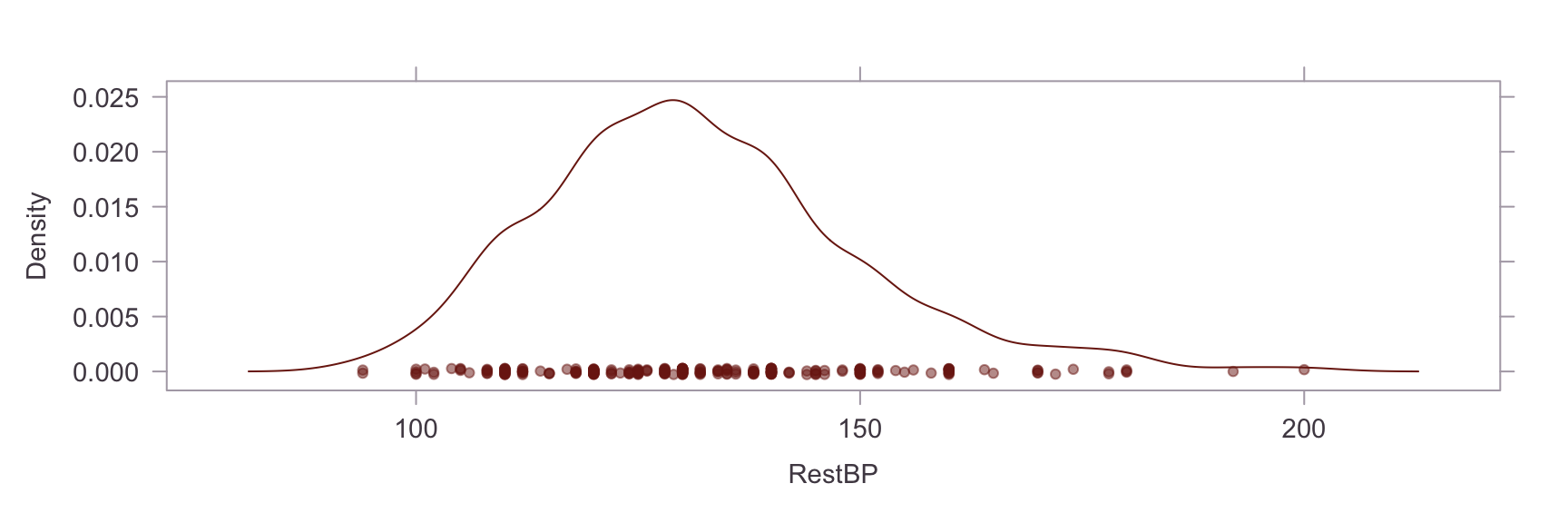
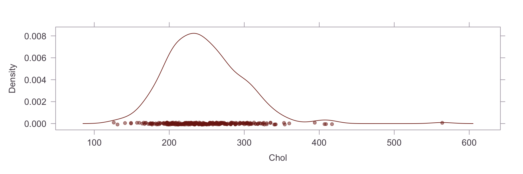
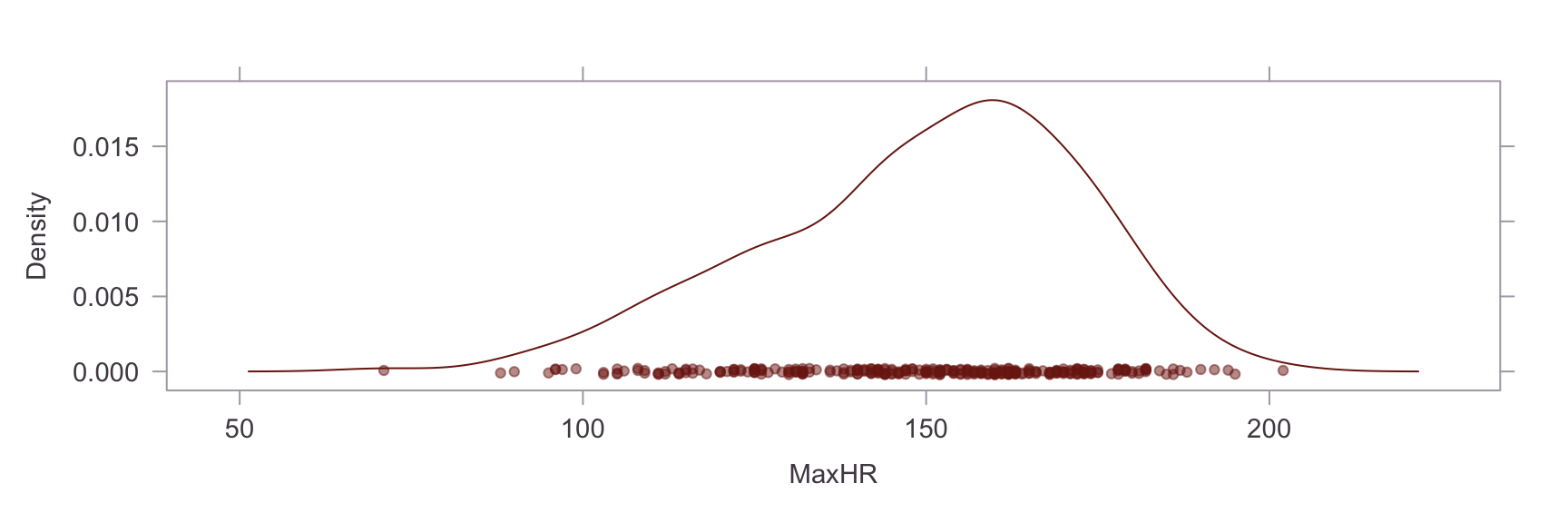
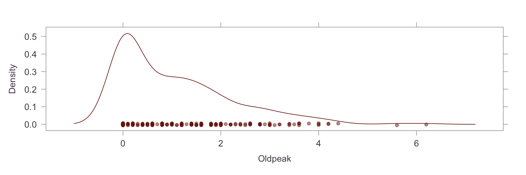
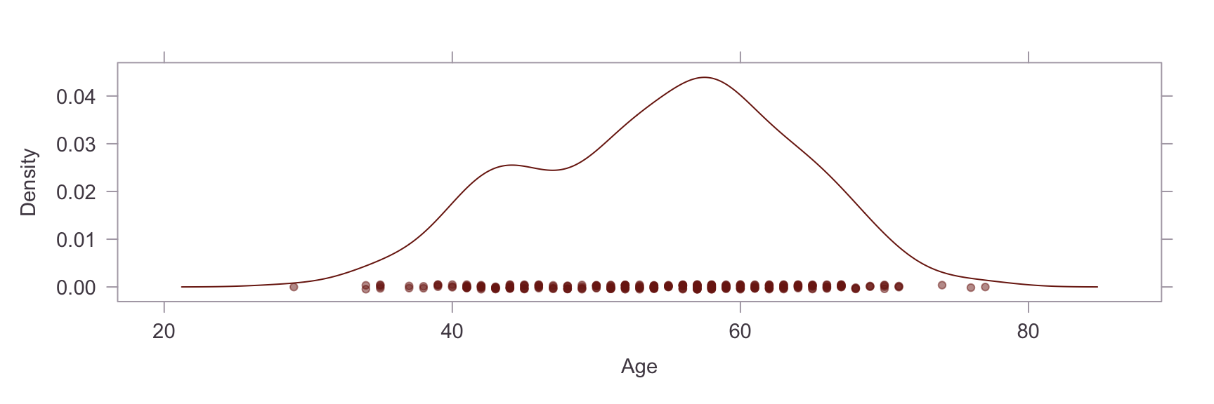
Next, we show a kernel density plot of each numeric variables.
1
## Skew
1
2
##        Age     RestBP       Chol      MaxHR    Oldpeak 
## -0.2069951  0.6990596  1.1242853 -0.5321391  1.2571761

A visual inpection of the above plots reveals skew and non-normality in the Oldpeak and Chol variables. This is confirmed by a statistical test for skew, where values of skew >1 are severe. The skew in the Chol variable appears to be caused by an outlier. Briefly researching this matter online, it is apparent that a reading of >200 for cholesterol is already considered extremely high and the problematic reading in our dataset is nearly 600. On the other hand, the Oldpeak variable is systemically skewed. Power transformations are unsuitable for this variable because of the prevalence of zero values, so this will be left as is.

Data Cleansing - Second Pass #

We will perform the following actions:

  1. Set the outlying Chol value to missing (NA),
  2. Impute missing values for Chol, Ca and Thal, and
  3. Scale all the variables between [0,1] - this is to support the distance based clustering techniques that we will use later.
 1
 2
 3
 4
 5
 6
 7
 8
 9
10
11
12
13
14
15
16
17
18
19
20
21
22
23
24
25
# modified min/max functions
minval <- function(x) min(x, na.rm = TRUE)
maxval <- function(x) max(x, na.rm = TRUE)

# change outlier to missing
heart$Chol[which.max(heart$Chol)] <- NA

# scale to [0, 1]
for (nv in num_vars) {
  this_nv <- pull(heart, nv) 
  if(minval(this_nv) < 0) {
    heart[[nv]] <- (this_nv + abs(minval(this_nv))) / 
      (maxval(this_nv) + abs(minval(this_nv)))  
  } else {
    heart[[nv]] <- (this_nv - minval(this_nv)) / 
      (maxval(this_nv) - minval(this_nv))
  }
}

# impute missing - VIM package. Median is the default function. Pick a moderately large k
heart <- as_tibble(kNN(heart, c("Chol", "Ca", "Thal"), imp_var = FALSE, k=11))

# for later use
heart_num <- select(heart, num_vars)
heart_cat <- select(heart, cat_vars)
1
## Recoded data set
 1
 2
 3
 4
 5
 6
 7
 8
 9
10
11
12
13
14
15
## # A tibble: 303 × 14
##      Age Sex   ChestPain    RestBP  Chol Fbs   RestECG MaxHR ExAng Oldpeak Slope
##    <dbl> <fct> <chr>         <dbl> <dbl> <fct> <fct>   <dbl> <fct>   <dbl> <fct>
##  1 0.708 M     typical       0.481 0.368 >120  abnorm… 0.603 No     0.371  level
##  2 0.792 M     asymptomatic  0.623 0.550 <=120 abnorm… 0.282 Yes    0.242  level
##  3 0.792 M     asymptomatic  0.245 0.354 <=120 abnorm… 0.443 Yes    0.419  level
##  4 0.167 M     nonanginal    0.340 0.426 <=120 normal  0.885 No     0.565  level
##  5 0.25  F     nontypical    0.340 0.268 <=120 abnorm… 0.771 No     0.226  down 
##  6 0.562 M     nontypical    0.245 0.378 <=120 normal  0.817 No     0.129  down 
##  7 0.688 F     asymptomatic  0.434 0.488 <=120 abnorm… 0.679 No     0.581  level
##  8 0.583 F     asymptomatic  0.245 0.784 <=120 normal  0.702 Yes    0.0968 down 
##  9 0.708 M     asymptomatic  0.340 0.440 <=120 abnorm… 0.580 No     0.226  level
## 10 0.5   M     asymptomatic  0.434 0.265 >120  abnorm… 0.641 Yes    0.5    level
## # ℹ 293 more rows
## # ℹ 3 more variables: Ca <ord>, Thal <chr>, HDisease <chr>
 1
 2
 3
 4
 5
 6
 7
 8
 9
10
11
12
13
14
15
16
17
18
19
20
21
##       Age         Sex      ChestPain             RestBP            Chol       
##  Min.   :0.0000   F: 97   Length:303         Min.   :0.0000   Min.   :0.0000  
##  1st Qu.:0.3958   M:206   Class :character   1st Qu.:0.2453   1st Qu.:0.2921  
##  Median :0.5625           Mode  :character   Median :0.3396   Median :0.3952  
##  Mean   :0.5300                              Mean   :0.3556   Mean   :0.4112  
##  3rd Qu.:0.6667                              3rd Qu.:0.4340   3rd Qu.:0.5103  
##  Max.   :1.0000                              Max.   :1.0000   Max.   :1.0000  
##     Fbs          RestECG        MaxHR        ExAng        Oldpeak      
##  <=120:258   abnormal:152   Min.   :0.0000   No :204   Min.   :0.0000  
##  >120 : 45   normal  :151   1st Qu.:0.4771   Yes: 99   1st Qu.:0.0000  
##                             Median :0.6260             Median :0.1290  
##                             Mean   :0.6001             Mean   :0.1677  
##                             3rd Qu.:0.7252             3rd Qu.:0.2581  
##                             Max.   :1.0000             Max.   :1.0000  
##    Slope     Ca          Thal             HDisease        
##  down :142   0:179   Length:303         Length:303        
##  level:161   1: 66   Class :character   Class :character  
##              2: 38   Mode  :character   Mode  :character  
##              3: 20                                        
##                                                           
## 

Bivariate Distributions #

We would now like to look for colinearity or correlation among the predictors. A simple bivariate correlation analysis is conducted.
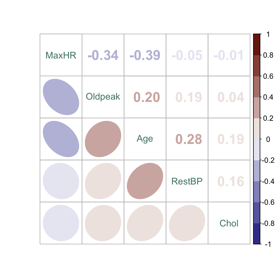
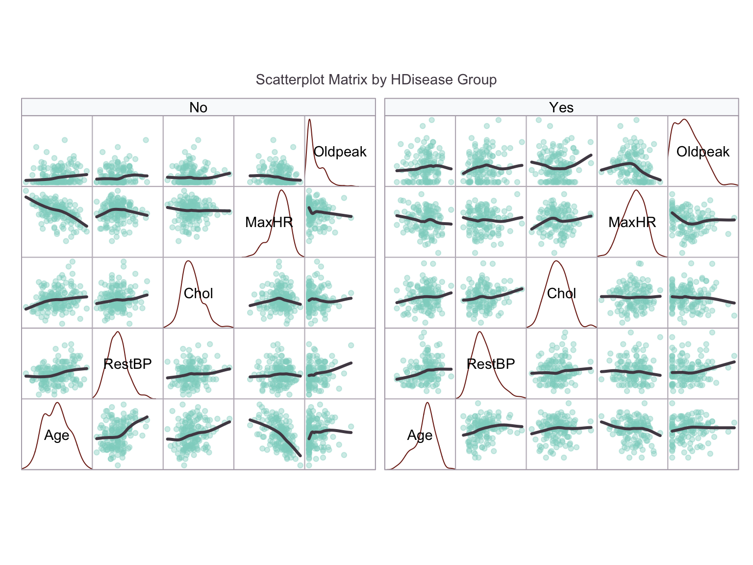
Careful inspection of the splom shows a clear elevation of Oldpeak in the HDisease = Yes group. There is a potentially interesting interaction between Age and MaxHR, which is the pair with the strongest correlation: Specifically, MaxHR is more correlated with Age in the HDisease = No group, whereas MaxHR is slightly lower whatever the Age in the HDisease = Yes group. The HDisease = Yes group are formed from a narrower Age band, indicating that a particular age range could carry higher risk. The remaining continuous variables may be less informative.

Identifying Candidate Predictors #

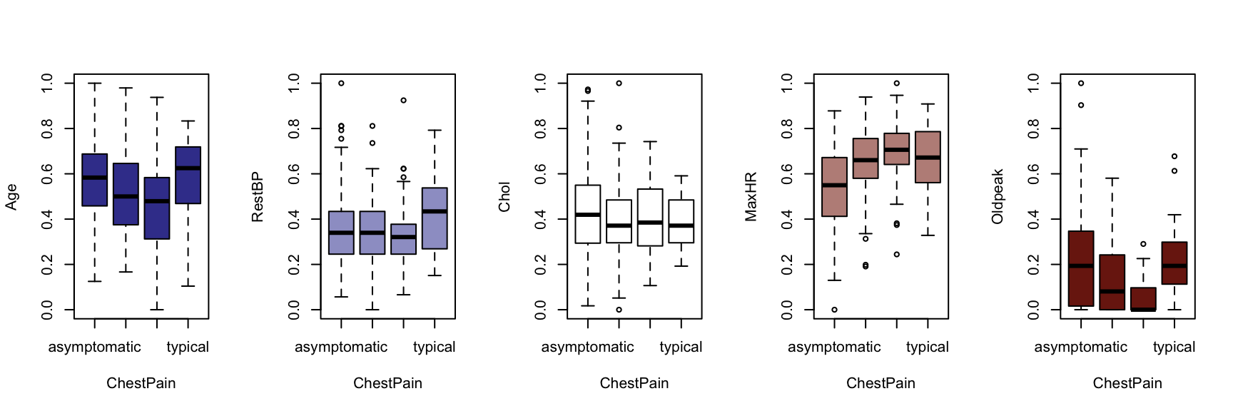
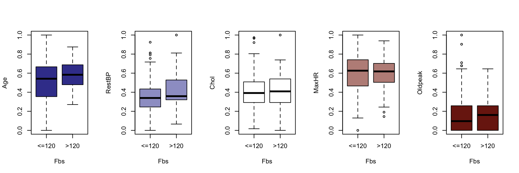
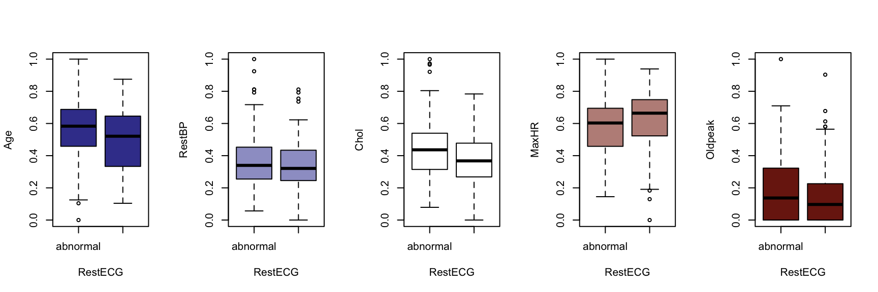
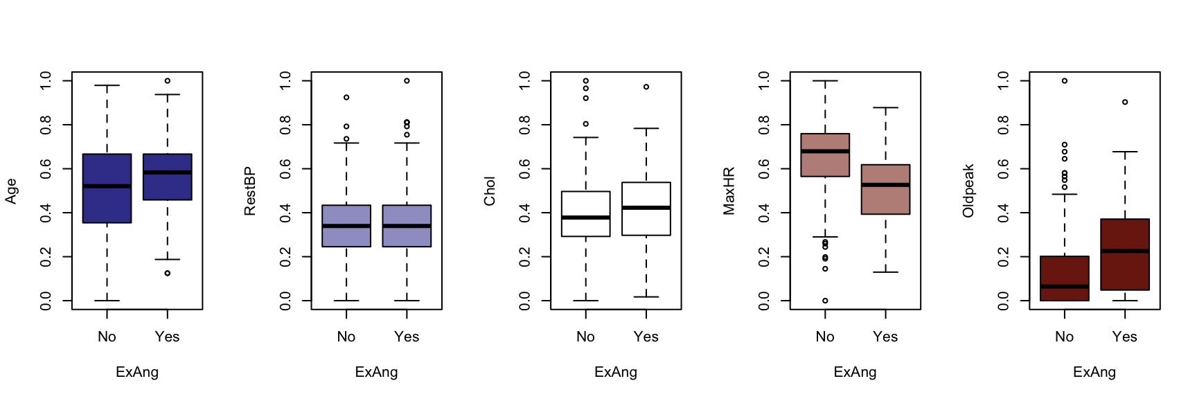
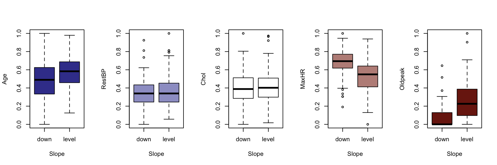
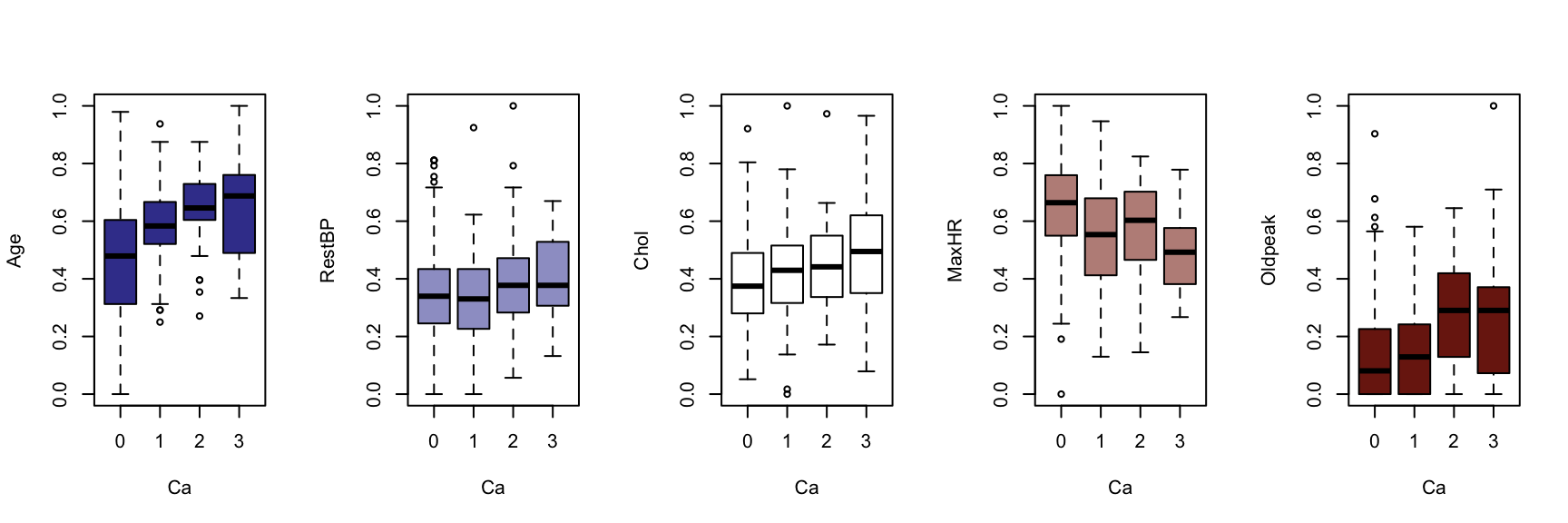
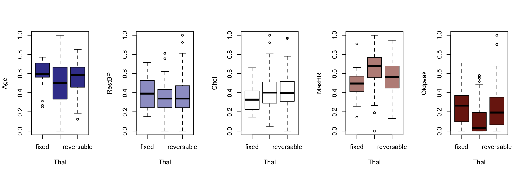
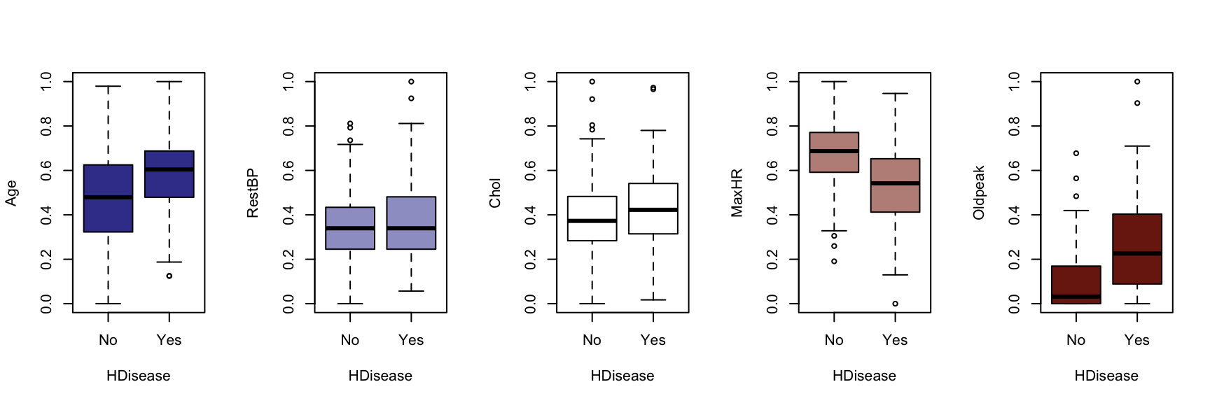
We now generate a boxplot for each of the five continuous variables, conditioned on each of the factor variables. At this point, we include the HDisease variable to evaluate candidate predictors. This knowledge would be useful prior to developing a classification model of some kind.

The figures that follow need to be assessed row by row.
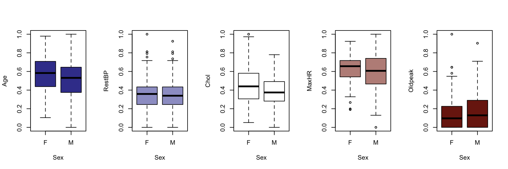
A visual instpection of the boxplots indicates that there may be some interaction between Chestpain and the three informative variables identified previously (Age, MaxHR and Oldpeak). This is also true of ExAng (exercise induced angina), Slope, Ca and Thal. We will not perform any statistical tests at this stage. Fishing for p-values with so many tests requires careful attention to the false discovery rate, and assumptions checking and diagnostics for an unwieldy number of variable combinations. It is sufficient to develop an intuition about the data and interactions.

Multivariate Counts #

Distributions among categorical variables can be assessed according to counts and proportions. The following Fourfold and Mosaic visualisations implicitly perform significance tests by means of shading residuals. Fourfold plots are suited to visualising pairs of binary variables, while mosaics can handle factors with more levels.
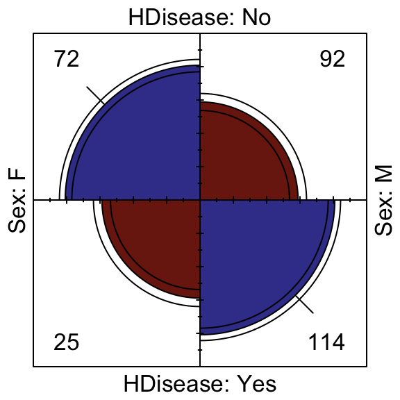
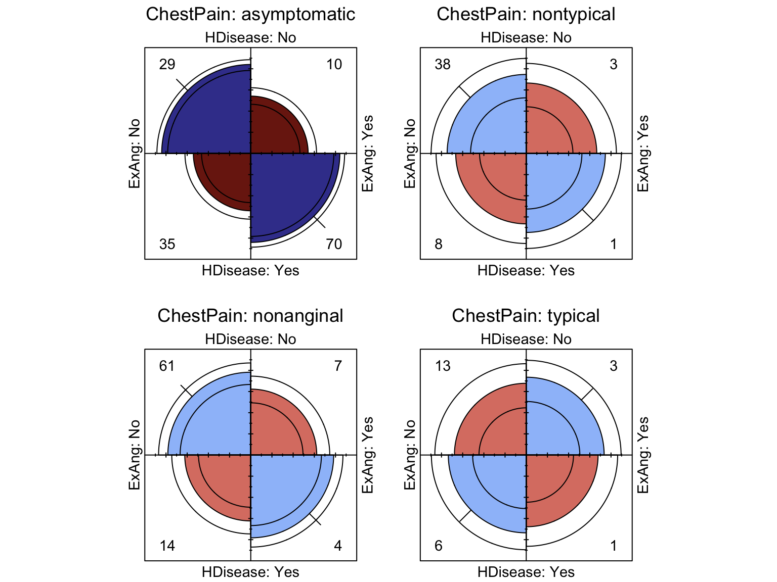
We can see that the presence of atherosclerotic heart disease is significantly associated with males, while a third order interaction exists such that those who are generally free from chest pain but suffer with exercise induced angina have a significant risk of atherosclerotic heart disease.
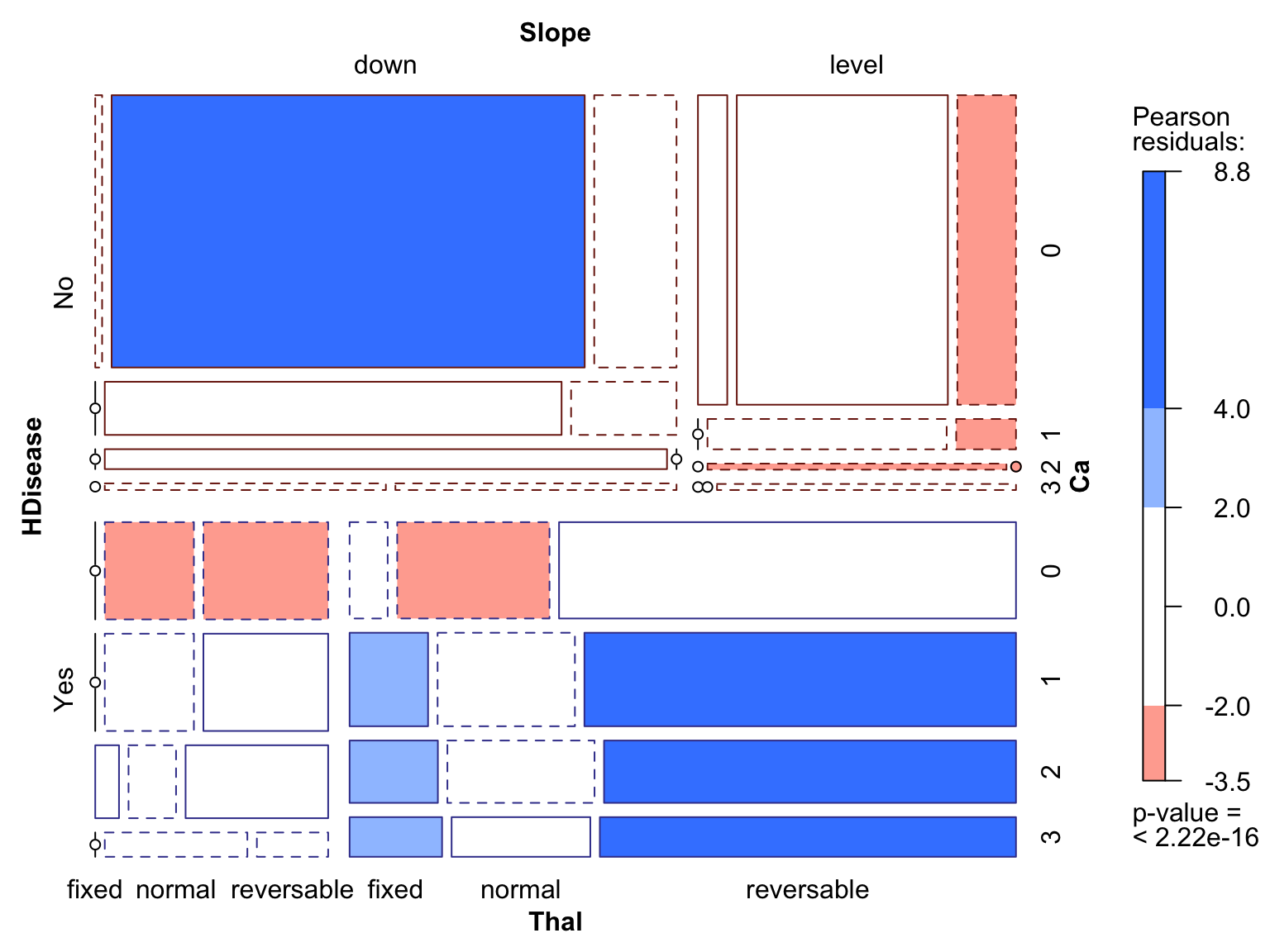
The mosaic plot shows a four way analysis, which requires some explanation to those unfamiliar with this technique. Mosaics plots may look daunting at first, but quickly become intuitive with a little practice. They visualise a recursive partition. In this case, starting on the right with HDisease, the plot canvas is split horizontally into two tiles for “Yes” and “No”. Going clockwise, the tiles are split vertically for Slope “down” and “level”. Next, the tiles are split horizontally again for all the levels of Ca, into the existing two levels of HDisease. Finally, the collection of tiles are split veritcally once more for each level of Thal into the Slope levels. At each split, the tile areas are set to be proportional to the count at each intersection of variables. Independent variables would show up as evenly spaced and evenly sized tiles, where each tile would be proportional is size/count to the marginal totals. Discontinuities in the slice lines show up when an intersection between variables contains significantly more or fewer counts than expected under the independence assumption. When this occurs, the tiles are shaded in a two level gradient: blue/red for positive/negative association compared to the independence assumption, which aids the observer in understanding positive and negative associations. The shading values are based on the residuals when compare to a non-significant \(\chi^2\) test.

We can see that downward slope is most associated with the HDisease = No group and level slope for HDisease = Yes. Similarly, one or more arteries visible under fluoroscopy (Ca) are most strongly associated with HDisease = Yes. A third order interaction indicates that a combination of level Slope and reversible Thal is very strongly associated with HDisease = Yes, with fixed Thal also being strongly indicative.

Unuspervised Learning Methods #

We continue with a more advanced exploration of this data set.

PCA #

The first method we will exlore is principle components analysis (PCA) on the scaled continuous variables. PCA identifies orthogonal projections of multivariate data that capture most of the variation in the first components.

 1
 2
 3
 4
 5
 6
 7
 8
 9
10
## Standard deviations (1, .., p=5):
## [1] 0.2423102 0.1803325 0.1635007 0.1514306 0.1241028
## 
## Rotation (n x k) = (5 x 5):
##                PC1        PC2        PC3        PC4        PC5
## Age     -0.6025250  0.3042504 -0.4586509  0.2202109  0.5343611
## RestBP  -0.3156058  0.4109580  0.4662090  0.5759948 -0.4270663
## Chol    -0.1892079  0.6063496  0.1497098 -0.7478426 -0.1218969
## MaxHR    0.4950597  0.3664037  0.4208113  0.1503096  0.6488367
## Oldpeak -0.5064314 -0.4864501  0.6105680 -0.1946165  0.3102009
1
2
3
4
5
## Importance of components:
##                           PC1    PC2    PC3    PC4     PC5
## Standard deviation     0.2423 0.1803 0.1635 0.1514 0.12410
## Proportion of Variance 0.3756 0.2081 0.1710 0.1467 0.09854
## Cumulative Proportion  0.3756 0.5837 0.7548 0.9015 1.00000

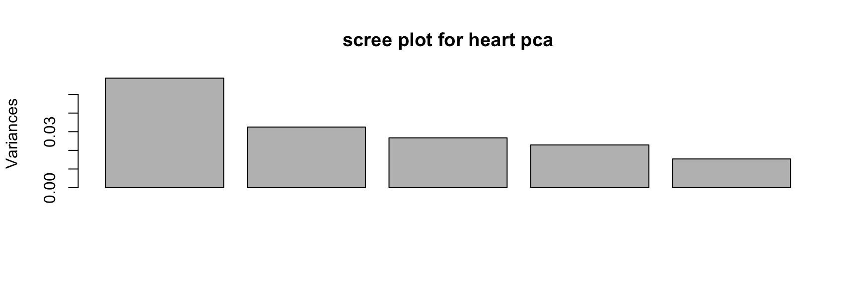
We can see from the output summary that Age and Oldpeak are loaded onto PC1 in the opposite direction to MaxHR, indicating a negative correlation. The other PCs can generally be interpreted according to further relationships among these variables, some of which we have already seen in the bivariate correlation analysis. It seems from the cumulative variance measure and the scree plot that the projection of these five numeric features onto less interpretable principal components does not offer any obvious gains; it still takes four components to capture most of the variance, nearly the same number as the raw variables. Nevertheless, we can make a biplot in an attempt to better understand the multivariate relationships.
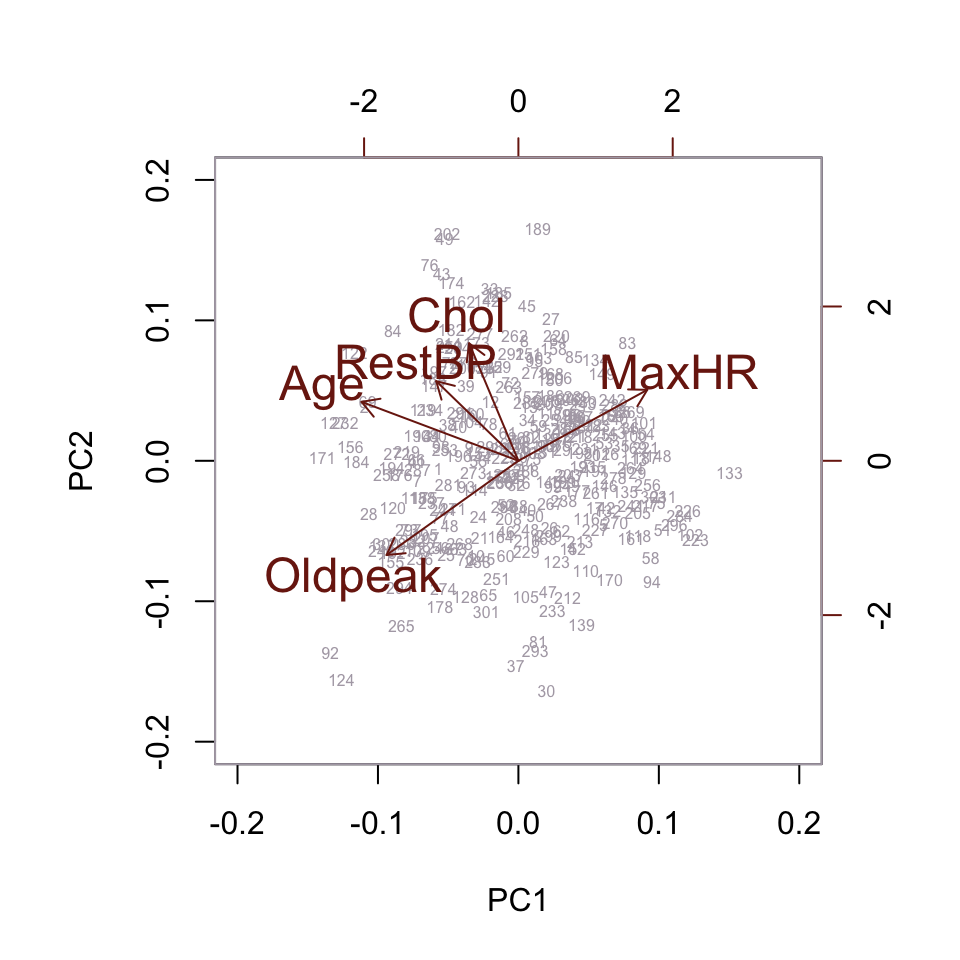
The biplot doesn’t reveal any useful new information, so we proceed to the next technique.

Multiple Correspondence Analysis #

Multiple correspondence analysis is a dimension reduction and clustering analysis for categorical counts. Variables with strong count associations tend toward the same direction in a biplot, and we would expect some of the relationships revealed in the mosaic plot above to be evident here as well.

As with PCA, the relationships among several or many categorical variables can be mapped in two dimensions, giving fairly intiuitive results. A less well-known benefit is that categorical variables are implicitly re-coded into non-abritrary numeric values. This makes them available to use in any methods that only accept real-valued inputs, such as distance-based methods like k-means or hierarchical clustering.

 1
 2
 3
 4
 5
 6
 7
 8
 9
10
11
## 
## Principal inertias (eigenvalues):
## 
##  dim    value      %   cum%   scree plot               
##  1      0.060363  83.7  83.7  ************************ 
##  2      0.000879   1.2  84.9                           
##  3      0.000424   0.6  85.5                           
##  4      0.000320   0.4  85.9                           
##  5      2.1e-050   0.0  85.9                           
##  6      1.2e-050   0.0  85.9                           
...

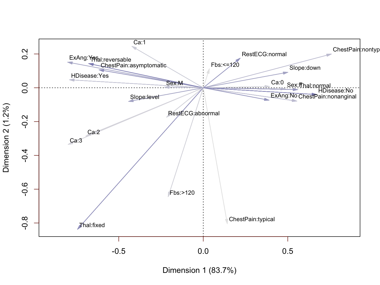
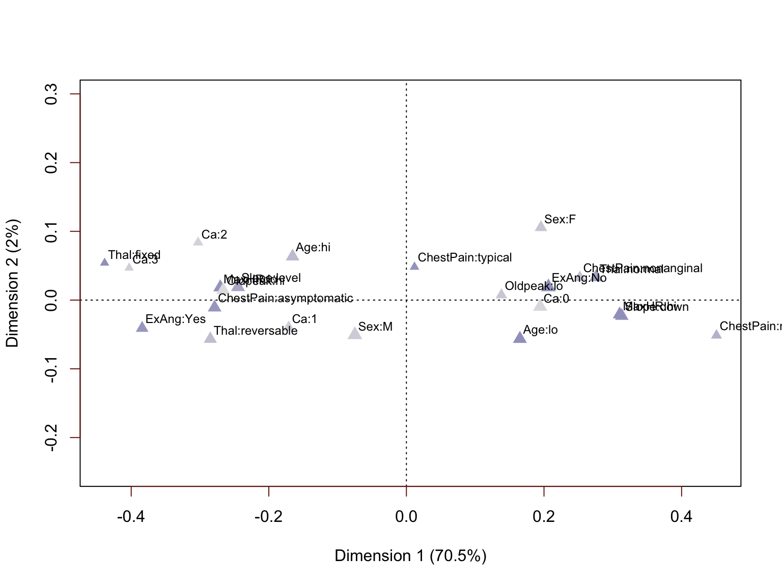
The results of this analysis are indeed rather interesting and confirm the findings of the initial explaratory analysis. The plot can be interpreted by identifying attributes that have moved in the same direction from the origin (0, 0), with particular interest in those that have clustered close together. We can see the specific values of ChestPain, Slope, Ca, ExAng and Sex that are associated with the presence of absence of heart diseease. We also have confirmation that Fbs is much less correlated with HDisease and RestECG only moderately correlated. If we were going on to do predictive modeling, this analysis would provide a stong case for excluding them. In fact, we will re-run this analysis excluding those variables to demonstrate the impact.

 1
 2
 3
 4
 5
 6
 7
 8
 9
10
11
12
## 
## Principal inertias (eigenvalues):
## 
##  dim    value      %   cum%   scree plot               
##  1      0.102077  88.4  88.4  *************************
##  2      0.000790   0.7  89.1                           
##  3      0.000493   0.4  89.5                           
##  4      0.000214   0.2  89.7                           
##  5      2e-05000   0.0  89.7                           
##         -------- -----                                 
##  Total: 0.115476                                       
...

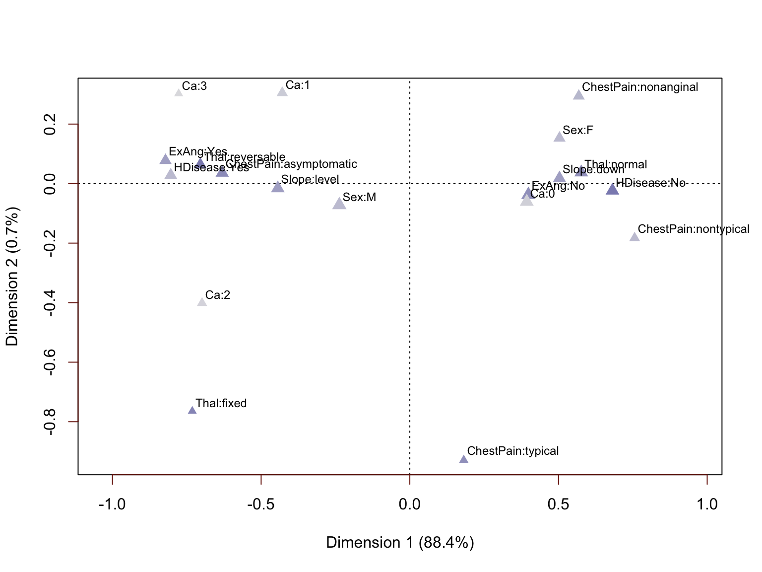
We are not displaying the arrows this time because the labels themselves are rather crowded and hard enough to read without the extra visual clutter. We can see that the clusters are very pronounced and we can once again identify a handful of less informative attributes. For example, Thal=fixed and ChestPain=typical represent small minorities in the way these variables are distributed.

We can augment this analysis by discretizing the numeric variables and including them as well. This will be done by binning into low and high levels.

 1
 2
 3
 4
 5
 6
 7
 8
 9
10
11
hilo <- function(x, ind) {
  cut(x, breaks=c(quantile(pull(heart, ind), probs = c(0, 0.5, 1))),
      labels = c("lo", "hi")
      )
}
binned <- as_tibble(sapply(num_vars
                , function(ind) sapply(select(heart, ind)
                                       , hilo
                                       , ind = ind)))
names(binned) <- num_vars
heart_bins <- bind_cols(heart_cat, binned)
 1
 2
 3
 4
 5
 6
 7
 8
 9
10
11
12
13
14
15
## 
## Principal inertias (eigenvalues):
## 
##  dim    value      %   cum%   scree plot               
##  1      0.056110  74.6  74.6  ***********************  
##  2      0.001968   2.6  77.2  *                        
##  3      0.001005   1.3  78.6                           
##  4      0.000532   0.7  79.3                           
##  5      0.000158   0.2  79.5                           
##  6      4.9e-050   0.1  79.5                           
##  7      2.3e-050   0.0  79.6                           
##         -------- -----                                 
##  Total: 0.075208                                       
## 
...

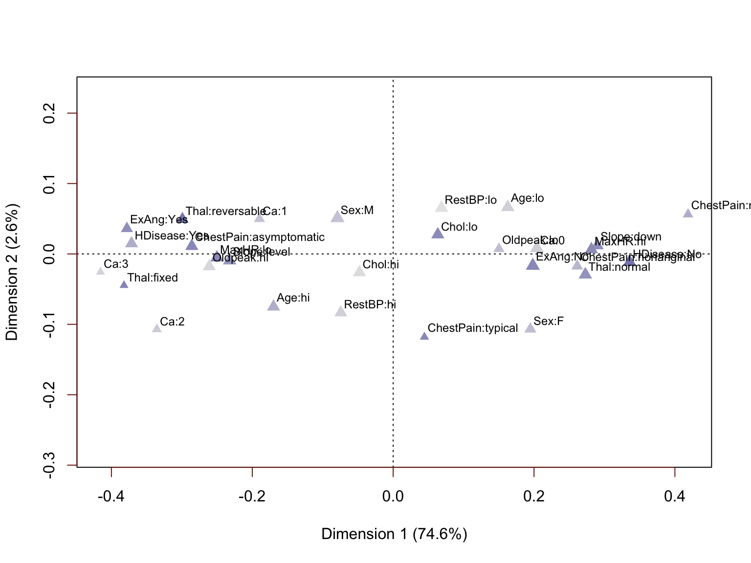
This plot takes some time to interpret, but a careful look further confirms results of our previous analyses. The lowest MaxHR values are associated with heart disease and the highest values with absence of disease. Increasing Age is generally associated with presence of heart disease. Increasing Chol is associated, but only very moderately (the Chol attribute levels are not separated widely on the horizontal dimension). The same is true for RestBP. Let us re-run this once more, excluding these two less correlated variables. We also exclude the HDisease label as we do not want it to influence the resulting numerical values.

 1
 2
 3
 4
 5
 6
 7
 8
 9
10
11
12
13
14
## 
## Principal inertias (eigenvalues):
## 
##  dim    value      %   cum%   scree plot               
##  1      0.062594  70.5  70.5  ************************ 
##  2      0.001733   2.0  72.5  *                        
##  3      0.000913   1.0  73.5                           
##  4      0.000390   0.4  74.0                           
##  5      0.000266   0.3  74.3                           
##  6      6.5e-050   0.1  74.3                           
##  7      2.8e-050   0.0  74.4                           
##         -------- -----                                 
##  Total: 0.088746                                       
...
 1
 2
 3
 4
 5
 6
 7
 8
 9
10
11
12
13
14
## $rows
##      Dim1 Dim2
## <NA>   NA   NA
## 
## $cols
##                               Dim1         Dim2
## Sex:F                   0.19555307  0.105634316
## Sex:M                  -0.07492566 -0.050559816
## ChestPain:asymptomatic -0.27881108 -0.010815584
## ChestPain:nonanginal    0.25208525  0.032753180
## ChestPain:nontypical    0.45068134 -0.051398877
## ChestPain:typical       0.01173958  0.048169595
## ExAng:No                0.20642820  0.019043790
...

This multiple correspondence analysis provides two very well differentiated clusters of attributes. This result was generated in the absence of the HDisease variable, yet we have plenty of reason to believe that these engineered variables we could are strongly predictive. Nearly all the inertia (variance) is captured on the first dimension, we can use the one-dimensional coordinate values from this dimension as numerical proxies for the categorical attributes in the analyses to follow.

 1
 2
 3
 4
 5
 6
 7
 8
 9
10
11
12
13
14
15
16
# res is the plot object created by (res <- plot(...))
# the last 6 rows are the three continuous vars, and we just want to convert categorical to real valued.
coords <- data.frame(res$cols, heart_mca$factors)[-(20:25), ]

# We don't need the HDisease feature as we will see how well the clusters match these labels.
# We'll add a column of missing values for each of the other categorical variables
heart_real <- select(heart_num, -Chol, -RestBP)
for(cv in names(select(heart_cat, -HDisease))) { # Fbs and RestECG were removed already
  heart_real <- mutate(heart_real, !!cv := NA)
}
# Now we'll insert the value from Dim 1 for each level of each factor
for(i in 1:nrow(coords)) {
  fac <- as.character(coords$factor[i])
  lev <- as.character(coords$level[i])
  heart_real <- mutate(heart_real, !!fac := ifelse(pull(heart, fac) == lev, coords$Dim1[i], pull(heart_real, fac)))
}

Distance-based Clustering #

Now that we have selected our variables of interest and converted categorical values to non-arbitrary real-values, we can continue with distance based clustering. The following visualisation is a map of all the Euclidean distances between the points.
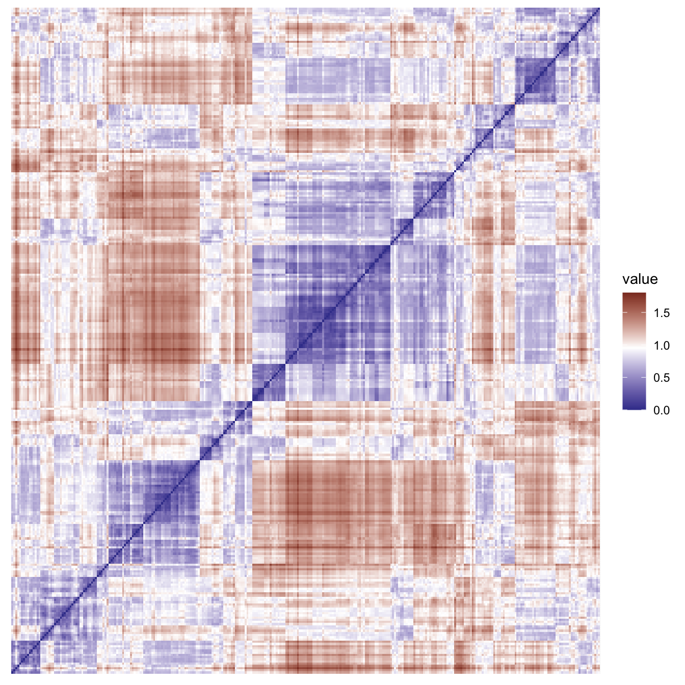
This visualisation provides a useful confirmation of the clustering tendency in this data. We can also compute the Hopkins statistic H, which tests the null hypothesis that the data has come from a uniform distribution and is distributed as \(H \sim \mathit{Beta}(n, n)\) where n is the number of samples used to calculate the statistic. Values of H 0-0.3 indicate regularly-spaced data. Values around 0.5 indicate random data. Values 0.7-1 indicate clustered data.

1
2
H <- hopkins::hopkins(heart_real)
H
1
## [1] 0.9987419

This H value indicates very well clustered data.

K-medoids Clustering #

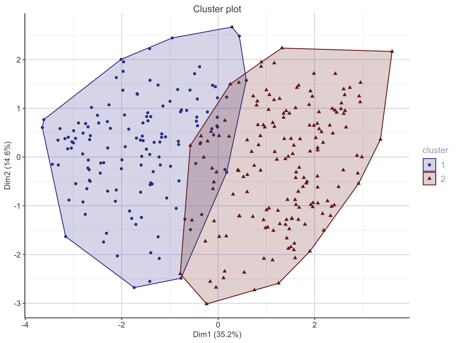
K-medoids searches for k archetypal or representative instances, called medoids that act as the cluster centres. Each non-medoid instance is assigned to its nearest medoid. The algorithm proceeds by swapping medoid and non-medoid points, accepting a swap that decreases the sum of a dissimilarity function. K-medoids is less sensitive to outliers than the classic K-means method, so is often favoured. Another reason to prefer K-medoids is that the number k can be estimated using the silhouette method. From the knowledge we have already that these variables tend to be associated with presence or absence of heart disease, we could assume two clusters is the correct number, but it’s still worth checking using this visual inspection.
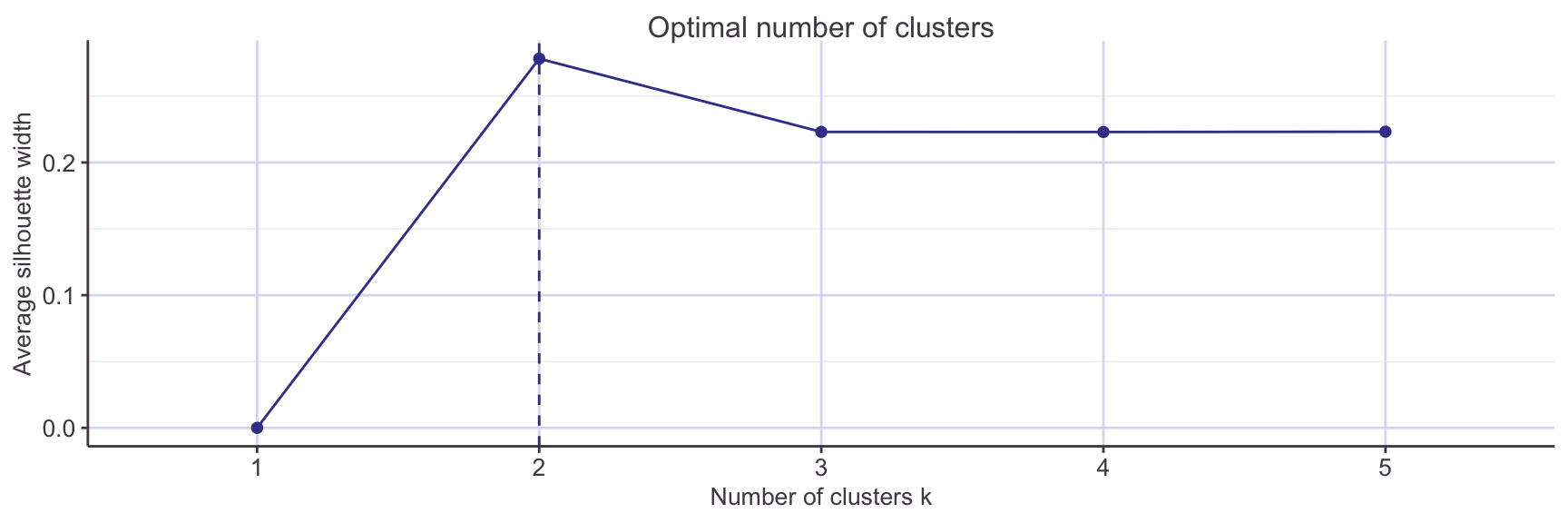
With confidence we can run the clustering with k=2:

1
2
3
4
5
6
##            Age     MaxHR   Oldpeak         Sex  ChestPain      ExAng      Slope
## [1,] 0.5416667 0.4656489 0.1935484 -0.07492566 -0.2788111 -0.3841233 -0.2447590
## [2,] 0.4375000 0.7022901 0.0000000 -0.07492566  0.2520853  0.2064282  0.3130363
##              Ca       Thal
## [1,] -0.1711661 -0.2850512
## [2,]  0.1944836  0.2757814
1
2
3
4
##    
##      No Yes
##   1  25 114
##   2 139  25

Recall that HDisease was not included in the real-valued data cpnversion nor the clustering process. Cross-tabulating the instances from the original dataset shows a “confusion matrix-like” result, indicating that the two clusters have captured the association with heart disease among the variables of interest. The cluster labels are arbitrary in this unsupervised learning process. We can set the appropriate label to the cluster id and get a full suite of diagnostics:

 1
 2
 3
 4
 5
 6
 7
 8
 9
10
11
12
13
14
15
16
17
18
19
20
21
22
23
24
25
26
27
## Confusion Matrix and Statistics
## 
##           Reference
## Prediction Yes  No
##        Yes 114  25
##        No   25 139
##                                          
##                Accuracy : 0.835          
##                  95% CI : (0.7883, 0.875)
##     No Information Rate : 0.5413         
##     P-Value [Acc > NIR] : <2e-16         
##                                          
##                   Kappa : 0.6677         
##                                          
##  Mcnemar's Test P-Value : 1              
##                                          
##             Sensitivity : 0.8201         
##             Specificity : 0.8476         
##          Pos Pred Value : 0.8201         
##          Neg Pred Value : 0.8476         
##              Prevalence : 0.4587         
##          Detection Rate : 0.3762         
##    Detection Prevalence : 0.4587         
##       Balanced Accuracy : 0.8339         
##                                          
##        'Positive' Class : Yes            
## 

We can see that if we assigned new, unlabelled points to their nearest cluster medoid, we might expect an accuracy of around 0.83

Hierarchical Clustering #

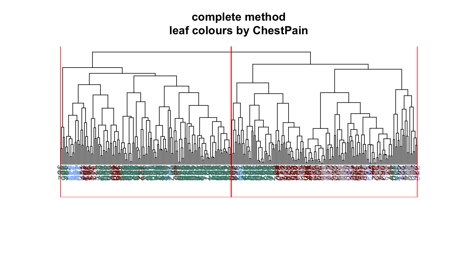
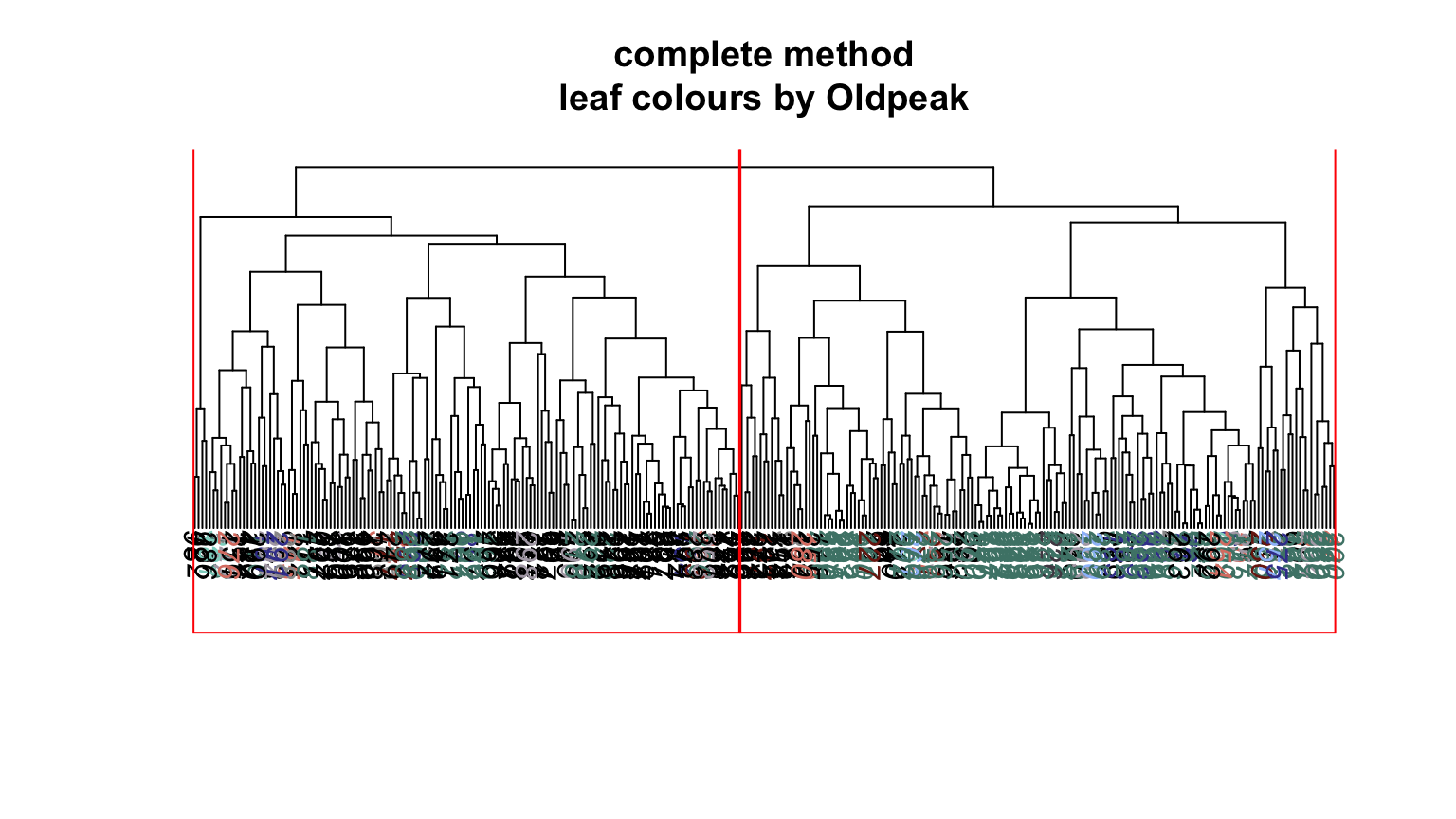
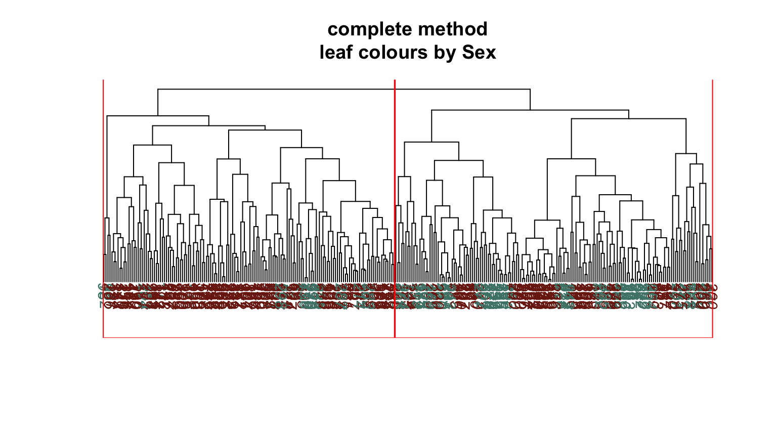
We can do something similar with hierarchical clustering. After some experimentation with different clustering methods, the “Complete” method was chosen as it produced two distinct clusters with similar numbers of members.

 1
 2
 3
 4
 5
 6
 7
 8
 9
10
11
12
13
14
15
16
17
18
19
20
21
22
23
24
25
26
27
## Confusion Matrix and Statistics
## 
##           Reference
## Prediction Yes  No
##        Yes 112  33
##        No   27 131
##                                           
##                Accuracy : 0.802           
##                  95% CI : (0.7526, 0.8454)
##     No Information Rate : 0.5413          
##     P-Value [Acc > NIR] : <2e-16          
##                                           
##                   Kappa : 0.6026          
##                                           
##  Mcnemar's Test P-Value : 0.5186          
##                                           
##             Sensitivity : 0.8058          
##             Specificity : 0.7988          
##          Pos Pred Value : 0.7724          
##          Neg Pred Value : 0.8291          
##              Prevalence : 0.4587          
##          Detection Rate : 0.3696          
##    Detection Prevalence : 0.4785          
##       Balanced Accuracy : 0.8023          
##                                           
##        'Positive' Class : Yes             
## 

Again, we can speculate on the accuracy we would get on prediction using just the cluster membership. This yields a slightly lower overall accuracy, but an increased specificity, or True Positive Rate. As such, this method might be more suitable when designing a diagnostic tool.

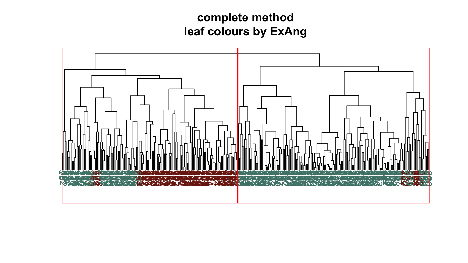
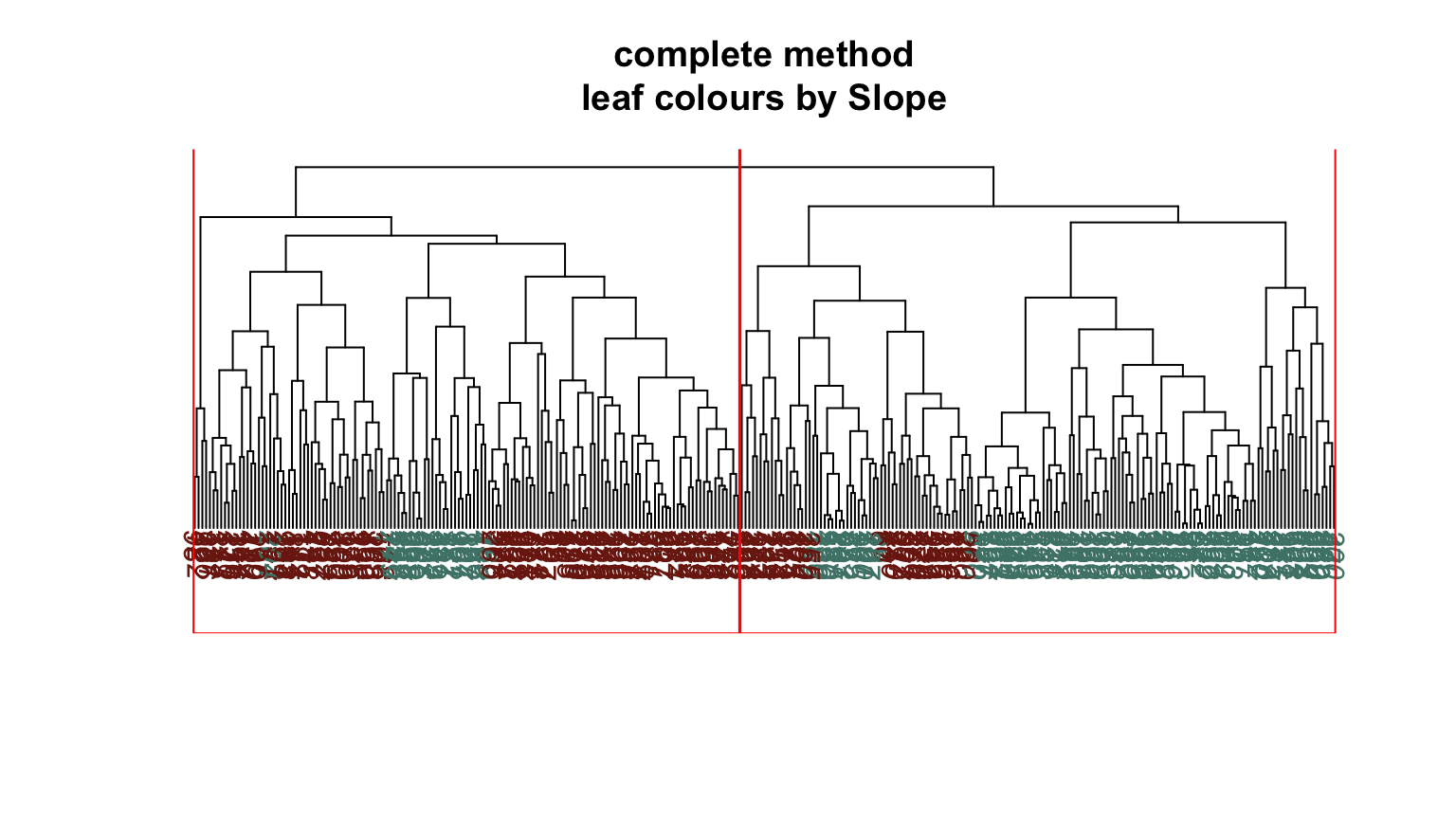
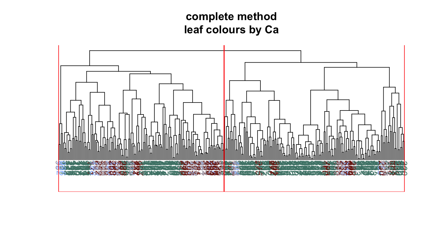
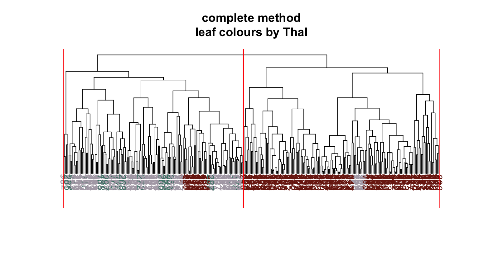
We can plot dendrograms of hierarchical clusters and colour the leaves using any factor variable. This provides a visual inspection of how the factor is distributed among the clusters, starting with the HDisease variable that we might want to classify at some future time. Again, recall that this “target variable” was not used in the clustering algorithm yet we can see that it is well separated into the two clusters. Note, the colours are arbitrary. What is interesting is how they have separated so well into prevalent groupings between the two clusters.
Conclusion #

We have performed a thorough exploratory analysis of the UCI Heart Data and used unsupervised machine learning methods to provide a visual intuition of important and potentially predictive structure in the data. We presented a reasoned approach to removing non-informative features and further reducing the dimension of the problem by correspondence analysis. After this, we were able to engineer a single, highly informative cluster membership feature, with very good potential as a diagnostic (classification) tool for similarly distributed data.

Appendix #

Here you can find the source code.

  1
  2
  3
  4
  5
  6
  7
  8
  9
 10
 11
 12
 13
 14
 15
 16
 17
 18
 19
 20
 21
 22
 23
 24
 25
 26
 27
 28
 29
 30
 31
 32
 33
 34
 35
 36
 37
 38
 39
 40
 41
 42
 43
 44
 45
 46
 47
 48
 49
 50
 51
 52
 53
 54
 55
 56
 57
 58
 59
 60
 61
 62
 63
 64
 65
 66
 67
 68
 69
 70
 71
 72
 73
 74
 75
 76
 77
 78
 79
 80
 81
 82
 83
 84
 85
 86
 87
 88
 89
 90
 91
 92
 93
 94
 95
 96
 97
 98
 99
100
101
102
103
104
105
106
107
108
109
110
111
112
113
114
115
116
117
118
119
120
121
122
123
124
125
126
127
128
129
130
131
132
133
134
135
136
137
138
139
140
141
142
143
144
145
146
147
148
149
150
151
152
153
154
155
156
157
158
159
160
161
162
163
164
165
166
167
168
169
170
171
172
173
174
175
176
177
178
179
180
181
182
183
184
185
186
187
188
189
190
191
192
193
194
195
196
197
198
199
200
201
202
203
204
205
206
207
208
209
210
211
212
213
214
215
216
217
218
219
220
221
222
223
224
225
226
227
228
229
230
231
232
233
234
235
236
237
238
239
240
241
242
243
244
245
246
247
248
249
250
251
252
253
254
255
256
257
258
259
260
261
262
263
264
265
266
267
268
269
270
271
272
273
274
275
276
277
278
279
280
281
282
283
284
285
286
287
288
289
290
291
292
293
294
295
296
297
298
299
300
301
302
303
304
305
306
307
308
309
310
311
312
313
library(knitr)
library(tibble)
library(readr)
library(dplyr)
library(lattice)
library(ggplot2)
library(corrplot)
library(vcd)
library(psych)
library(car)
library(VIM)
library(ca)
library(factoextra)
library(cluster)
library(clustertend)
library(caret)
library(ape)
library(hopkins)

opts_chunk$set(warning = FALSE
              , message = FALSE
              , echo = FALSE
              )
opts_template$set(
  fig.wide = list(fig.height = 4.5, fig.width = 8, fig.align='center')
  , fig.wideX = list(fig.height = 3, fig.width = 9, fig.align='center')
  , fig.relaxed = list(fig.height = 6, fig.width = 8, fig.align='center')
  , fig.hugetile = list(fig.height = 7, fig.width = 7, fig.align='center')
  , fig.bigtile = list(fig.height = 5, fig.width = 5, fig.align='center')
  , fig.tile = list(fig.height = 3, fig.width = 3, fig.align='center')
)

hook_output <- knit_hooks$get("output")
knit_hooks$set(output = function(x, options) {
  lines <- options$output.lines
  if (is.null(lines)) {
    return(hook_output(x, options))  # pass to default hook
  }
  x <- unlist(strsplit(x, "\n"))
  more <- "..."
  if (length(lines)==1) {        # first n lines
    if (length(x) > lines) {
      # truncate the output, but add ....
      x <- c(head(x, lines), more)
    }
  } else {
    x <- c(more, x[lines], more)
  }
  # paste these lines together
  x <- paste(c(x, ""), collapse = "\n")
  hook_output(x, options)
})

par(mar = c(4,3,3,1))

set.seed(142136)

# graphing themes
source("HeartTheme.R")

# load data
heart <- as_tibble(read.csv("Heart.csv"))
variables_df <- data.frame(name = c("AtheroscleroticHDisease"
                                    , "Age", "Sex", "ChestPain"
                                    , "RestBP", "Chol", "Fbs"
                                    , "RestECG", "MaxHR"
                                    , "ExAng", "Oldpeak"
                                    , "Slope", "Ca", "Thal")
                           , type = c("factor", "integer"
                                      , "factor", "factor"
                                      , "integer", "integer"
                                      , "factor", "factor"
                                      , "integer", "factor"
                                      , "factor", "factor"
                                      , "small integer", "factor")
                           , notes = c("Presence of heart disease"
                                       , "Age in years", "The two accepted levels at the time of data collection"
                                       , "Presence/type of chest pain"
                                       , "Resting blood pressure mm Hg"
                                       , "Serum cholesterol mg/dl"
                                       , "Fasting blood sugar"
                                       , "Resting electrocardiograph results"
                                       , "Maximum heart rate during exercise"
                                       , "Exercise induced angina"
                                       , "ST depression exercise relative to rest"
                                       , "Slope of peak ST exercise segment"
                                       , "Number of major vessels under fluoroscopy"
                                       , "No description given"
                                       ))
kable(variables_df)
heart
summary(heart)
# recoding
heart <- heart %>% select(-X) %>%
  rename(HDisease = AtheroscleroticHDisease) %>%
  mutate(Sex = factor(ifelse(Sex == 1, "M", "F"))
         , Fbs = factor(ifelse(Fbs == 1, ">120", "<=120"))
         , RestECG = factor(ifelse(RestECG == 0, "normal"
                                   , "abnormal")) # there are only 4 valued at 1, we'll reduce to just two levels
         , ExAng = factor(ifelse(ExAng == 1, "Yes", "No"))
         , Slope = factor(ifelse(Slope == 1, "down", "level")) # there few valued at 3, we'll reduce to just two levels
         , Ca = factor(Ca, ordered = TRUE))

# identify numerical and categorical variables for later use
classes <- sapply(heart, function(x) class(x)[1])
num_vars <- names(classes)[classes %in% c("integer", "numeric")]
cat_vars <- names(classes)[!(classes %in% c("integer", "numeric"))]
image(is.na(select(heart, Ca, Thal))
      , main = "Missing Values"
      , xlab = ""
      , ylab = "Ca, Thal"
      , xaxt = "n"
      , yaxt = "n"
      , bty = "n"
      , col = c(myPal[4]
                   , myPalDark[5])
                   )
for (nv in num_vars) {
  densityplot(~pull(heart, nv)
             , xlab = nv
             , par.settings = myLatticeTheme) %>%
      print()
}

cat("Skew")
sapply(num_vars, function(ind) skew(pull(heart, ind)))
# modified min/max functions
minval <- function(x) min(x, na.rm = TRUE)
maxval <- function(x) max(x, na.rm = TRUE)

# change outlier to missing
heart$Chol[which.max(heart$Chol)] <- NA

# scale to [0, 1]
for (nv in num_vars) {
  this_nv <- pull(heart, nv) 
  if(minval(this_nv) < 0) {
    heart[[nv]] <- (this_nv + abs(minval(this_nv))) / 
      (maxval(this_nv) + abs(minval(this_nv)))  
  } else {
    heart[[nv]] <- (this_nv - minval(this_nv)) / 
      (maxval(this_nv) - minval(this_nv))
  }
}

# impute missing - VIM package. Median is the default function. Pick a moderately large k
heart <- as_tibble(kNN(heart, c("Chol", "Ca", "Thal"), imp_var = FALSE, k=11))

# for later use
heart_num <- select(heart, num_vars)
heart_cat <- select(heart, cat_vars)
cat("Recoded data set")
heart
summary(heart)
corrplot(cor(heart_num), order="AOE", type="upper"
        , col = myPal.rangeDiv(10)
        , tl.pos="d", tl.cex = 1, tl.col = myPalDark[1]
        , method = "number", number.cex = 1.5)
corrplot(cor(heart_num), add=TRUE, type = "lower"
        , col = myPal.rangeDiv(10)
        , method = "ellipse", order = "AOE", diag = FALSE
        , tl.pos="n", cl.pos = "n")
trel <- myLatticeTheme
trel$plot.symbol$col <- myPal[1]
splom(~heart_num | HDisease
      , data = heart
      , diag.panel = function(x, ...){
        yrng <- current.panel.limits()$ylim
        d <- density(x, na.rm=TRUE)
        d$y <- with(d, yrng[1] + 0.95 * diff(yrng) * y / max(y) )
        panel.lines(d)
        diag.panel.splom(x, ...)
 }
      , panel = function(x, y, ...){
        panel.xyplot(x, y, ..., alpha = 0.4)
        panel.loess(x, y, ..., col = myPalDark[2], lwd = 3)
      }
      , main = "Scatterplot Matrix by HDisease Group"
      , xlab = ""
      , layout = c(2, 1)
      , pscales = 0
      , par.settings = trel)
cols <- myPal.rangeDiv(5)
names(cols) <- num_vars
  
myBoxPlots <- function(nv, cv) {
  fmla <- as.formula(paste(nv, " ~ ", cv))
  boxplot(fmla, data = heart, col = cols[nv])
}
par(mfrow=c(1,5))
for (cv in cat_vars){
  for (nv in num_vars) {
    myBoxPlots(nv, cv)
  }
}
par(mfrow=c(1,1))
fourfold(with(heart, table(HDisease, Sex))
         , color = myFourFold)
fourfold(with(heart, table(HDisease, ExAng, ChestPain))
         , color = myFourFold)
mosaic(with(heart, table(HDisease, Slope, Ca, Thal))
       , gp = shading_hsv
       , gp_args = list(h = myShading["h", ]
                        , s = c(0.75, 0)
                        , v = 1
                        , lty = 1:2
                        , line_col = c(myPalDark[5], myPalDark[4])
                        )
       )
heart_pca <- prcomp(heart_num, scale. = FALSE)
heart_pca
summary(heart_pca)
plot(heart_pca, main = "scree plot for heart pca")
biplot(heart_pca
       , xlim = c(-0.2, 0.2), ylim = c(-0.2, 0.2)
       , col = c(myPal[2], myPalDark[5]), cex=c(0.5, 1.5))
heart_mca <- mjca(heart_cat)
summary(heart_mca)
plot(heart_mca, map = "symbiplot"
     , arrows = c(FALSE, TRUE)
     , mass = c(FALSE, TRUE)
     , contrib = c("none", "relative")
     , col = c(myPalDark[5], myPalDark[4]))
heart_cat <- select(heart_cat, -Fbs, -RestECG)
heart_mca <- mjca(heart_cat)
summary(heart_mca)
plot(heart_mca, map = "symbiplot"
     , mass = c(FALSE, TRUE)
     , contrib = c("none", "relative")
     , col = c(myPalDark[5], myPalDark[4]))
hilo <- function(x, ind) {
  cut(x, breaks=c(quantile(pull(heart, ind), probs = c(0, 0.5, 1))),
      labels = c("lo", "hi")
      )
}
binned <- as_tibble(sapply(num_vars
                , function(ind) sapply(select(heart, ind)
                                       , hilo
                                       , ind = ind)))
names(binned) <- num_vars
heart_bins <- bind_cols(heart_cat, binned)
heart_mca <- mjca(heart_bins)
summary(heart_mca)
plot(heart_mca, map = "symmetric"
     , mass = c(FALSE, TRUE)
     , contrib = c("none", "relative")
     , col = c(myPalDark[5], myPalDark[4]))
heart_mca <- mjca(select(heart_bins, -Chol, -RestBP, -HDisease))
summary(heart_mca)
(res <- plot(heart_mca, map = "symmetric"
     , mass = c(FALSE, TRUE)
     , contrib = c("none", "relative")
     , col = c(myPalDark[5], myPalDark[4])))
# res is the plot object created by (res <- plot(...))
# the last 6 rows are the three continuous vars, and we just want to convert categorical to real valued.
coords <- data.frame(res$cols, heart_mca$factors)[-(20:25), ]

# We don't need the HDisease feature as we will see how well the clusters match these labels.
# We'll add a column of missing values for each of the other categorical variables
heart_real <- select(heart_num, -Chol, -RestBP)
for(cv in names(select(heart_cat, -HDisease))) { # Fbs and RestECG were removed already
  heart_real <- mutate(heart_real, !!cv := NA)
}
# Now we'll insert the value from Dim 1 for each level of each factor
for(i in 1:nrow(coords)) {
  fac <- as.character(coords$factor[i])
  lev <- as.character(coords$level[i])
  heart_real <- mutate(heart_real, !!fac := ifelse(pull(heart, fac) == lev, coords$Dim1[i], pull(heart_real, fac)))
}
distance <- get_dist(heart_real)
myPalDiv <- myPal.rangeDiv(3)
fviz_dist(distance, show_labels = FALSE
          , gradient = list(low = myPalDiv[1], mid = myPalDiv[2], high = myPalDiv[3]))
H <- hopkins::hopkins(heart_real)
H
fviz_nbclust(heart_real, pam, method = "silhouette"
             , k.max = 5, linecolor = myPalDark[4]) +
  myGgTheme()
pam2_clus <- pam(heart_real, k = 2, diss = FALSE, metric = "euclidean")
pam2_clus$medoids # translate back
table(pam2_clus$cluster, heart$HDisease)
pam_factor <- factor(ifelse(pam2_clus$cluster == 1, "Yes", "No"))
hd_factor <- relevel(factor(heart$HDisease), "Yes")
cm <- confusionMatrix(pam_factor, hd_factor)
cm
fviz_cluster(pam2_clus, heart_real
             , ellipse.type = "convex"
             , geom = "point"
             , palette = c(myPalDark[4], myPalDark[5])) +
  myGgTheme()
hclus <- hclust(dist(heart_real)
                        , method="complete")
num_clus <- 2


clus_factor <- relevel(factor(ifelse(cutree(hclus, num_clus) == 1, "Yes", "No")), "Yes")
cm <- confusionMatrix(clus_factor, hd_factor)
cm
hclusPlot <- function(x, n, df, colourBy) {

  labelColours <- myPalContrasts[factor(df[[colourBy]])]

  # phylogenic tree plot
  plot(as.phylo(x)
     , direction = "downwards"
     , tip.color = myPalContrasts[factor(df[[colourBy]])]
     , main = paste(x$method, "method\nleaf colours by" , colourBy))
  rect.hclust(x, k=n, border = "red")
}

for (nm in names(heart_real)[!names(heart_real) %in% c("Age", "MaxHR")]) {
  hclusPlot(hclus, num_clus, heart, nm)
}
Tags:
Categories: